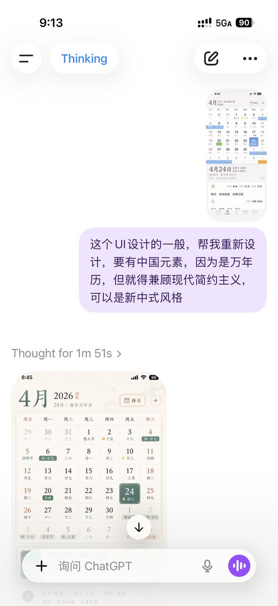
Elegant Chinese Calendar App UI
This prompt generates a polished mobile UI concept for a Chinese perpetual calendar and almanac app, suitable for app design showcases or product mockups.
プロンプト
洗練されたエレガントなiPhoneアプリUIモックアップ、中国の万年暦と almanac アプリ。柔らかく暖かい白の背景に微妙な紙のようなテクスチャと洗練された東アジアのエディトリアル美学で、フルスクリーンのモバイルスクリーンショットとして表示。インターフェースはミニマルなセリフとサンセリフの混ざり、控えめなブラウン、グレー、ブラック、淡いブルー、グリーン、ゴールドのアクセント、広々としたレイアウトと繊細な区切り。上部にiOSステータスバー、時刻8:45、通信信号、Wi-Fiアイコン、バッテリーインジケーター96。その下に、{argument name="month" default="4月"}のヘッダー、二次テキスト"24日 | 每日万年历"、右側に円角長方形の日付選択ボタン"择日"、カレンダーアイコンと別々のプラス記号。メインセクションは{argument name="year" default="2026"}の月間カレンダーグリッド、7の曜日列、日曜から土曜まで中国語で: 周日, 周一, 周二, 周三, 周四, 周五, 周六。正確に42日付セルを含む6行の月間ビューを描画。表示日付: 1行目29, 30, 31, 1, 2, 3, 4; 2行目5, 6, 7, 8, 9, 10, 11; 3行目12, 13, 14, 15, 16, 17, 18; 4行目19, 20, 21, 22, 23, 24, 25; 5行目26, 27, 28, 29, 30, 1, 2; 6行目3, 4, 5, 6, 7, 8, 9。各日付セルには大きなグレゴリオ暦日付と下に小さな中国の旧暦日付または注記。特定のセルに色分けされた祝日と節気タグを含み、正確に10のハイライト付きラベル: 4日"休十七"、5日"清明节"、6日"休十九"、20日"谷雨"を緑で、翌月1日"劳动节"、翌月2日"休十六"、最終行3日"休十七"、最終行4日"青年节"、最終行5日"休立夏"、最終行9日"天后诞"をオレンジで。数日間の旧暦フェーズマーカーを追加、2日、10日、17日、24日、および翌月2日の周囲に黄色い三日月またはドットアイコン。{argument name="selected date" default="24"}セルを金曜日列で目立たせ、角丸の青いグラデーションタイルと柔らかな影、内部に小さなテキスト"初八"。カレンダーの下に、空白で区切られた詳細な毎日の情報パネルを表示。左側に非常に大きな日付タイトル"4月24日";右側に"星期五 2026"と"农历三月初八"をスタック。その下に、小さなグレーのメタデータ行"第114天 · 第17周 金尊月"と伝統的な干支/日付文字列"丙午 · 马年 壬辰月 戊辰日"。メタデータエリアの最右に、丸角のアウライン pill ボタン"今日"。その後、 almanac ガイダンスの大きな白い丸角カード。カードには2つの主要セクション、正確に2つの見出し: 緑の"宜"セクションと赤の"忌"セクション、細かい点線で区切られた。"宜"セクションには、方向フォーチューンライン"喜神 东南 福神 正北 財神 正北"と3つのアクティビティ項目: "祭祀", "修饰垣墙", "余事勿取"。"忌"セクションには、コンフリクトライン"冲煞 冲狗 煞南"。底部に、正確にラベル"今日", "MONTH", "YEAR", "EVENTS", "MORE"の5アイテムiOSスタイルのタブバー;最初のタブがアクティブで、小さなサブラベル"4月24日"を含む。全体のスタイル: プレミアムアプリデザインコンセプト、落ち着いた学術的な中国暦の美学、高忠実度のモバイルプロダクトショット、リアルだが理想化されたインターフェース、完璧に整ったタイポグラフィ、微妙な影、柔らかなコントラスト、洗練されたスタートアップ品質のUI。
機械翻訳 — この作品を生成したのは元のプロンプトです。
元のプロンプト
A clean, elegant iPhone app UI mockup for a Chinese perpetual calendar and almanac app, shown as a full-screen mobile screenshot on a soft warm white background with subtle paper-like texture and refined East Asian editorial aesthetics. The interface uses a minimalist serif-and-sans mix, muted brown, gray, black, pale blue, green, and gold accents, with spacious layout and delicate dividers. Show the iOS status bar at the top with the time 8:45, cellular signal, Wi‑Fi icon, and a battery indicator reading 96. Below it, a header for {argument name="month" default="4月"} with secondary text “24日 | 每日万年历” and, on the right, a rounded rectangular date-picker button labeled “择日” with a calendar icon plus a separate plus symbol. The main section is a monthly calendar grid for {argument name="year" default="2026"}, with 7 weekday columns labeled Sunday through Saturday in Chinese: 周日, 周一, 周二, 周三, 周四, 周五, 周六. Render a 6-row month view with exactly 42 date cells including adjacent-month dates. The visible dates should be: first row 29, 30, 31, 1, 2, 3, 4; second row 5, 6, 7, 8, 9, 10, 11; third row 12, 13, 14, 15, 16, 17, 18; fourth row 19, 20, 21, 22, 23, 24, 25; fifth row 26, 27, 28, 29, 30, 1, 2; sixth row 3, 4, 5, 6, 7, 8, 9. Each day cell includes a large Gregorian date and a smaller Chinese lunar date or note underneath. Include colored holiday and solar-term tags across specific cells, with exactly 10 highlighted labels visible: “休十七” on the 4th, “清明节” on the 5th, “休十九” on the 6th, “谷雨” on the 20th in green, “劳动节” on the next-month 1st, “休十六” on the next-month 2nd, “休十七” on the last-row 3rd, “青年节” on the last-row 4th, “休立夏” on the last-row 5th, and “天后诞” on the last-row 9th in orange. Add small lunar phase markers on a few days, including yellow crescent or dot icons around the 2nd, 10th, 17th, 24th, and next-month 2nd. Make the {argument name="selected date" default="24"} cell in the Friday column stand out with a rounded blue gradient tile and soft shadow, with smaller text “初八” inside. Beneath the calendar, show a detailed daily information panel separated by whitespace. The left side features a very large date title “4月24日”; the right side stacks “星期五 2026” and “农历三月初八”. Below that, include smaller gray metadata lines such as “第114天 · 第17周 金尊月” and a traditional sexagenary/date string like “丙午 · 马年 壬辰月 戊辰日”. At the far right of this metadata area, place a rounded outline pill button labeled “今日”. Underneath, present a large white rounded card with almanac guidance. The card contains two major sections with exactly 2 headings: a green “宜” section and a red “忌” section, separated by fine dotted dividers. In the “宜” section, include the directional fortune line “喜神 东南 福神 正北 财神 正北” and three activity items: “祭祀”, “修饰垣墙”, “余事勿取”. In the “忌” section, include the conflict line “冲煞 冲狗 煞南”. At the bottom, show a 5-item iOS-style tab bar with labels exactly “今日”, “MONTH”, “YEAR”, “EVENTS”, “MORE”; the first tab is active and includes the small sublabel “4月24日”. Overall style: premium app design concept, calm scholarly Chinese calendar aesthetic, high-fidelity mobile product shot, realistic yet idealized interface, perfectly aligned typography, subtle shadows, soft contrast, and polished startup-quality UI.