Chinese Wealth Typography Poster
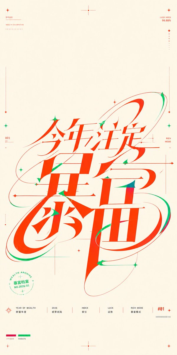
Generates a high-contrast experimental Chinese typographic poster with a giant custom wealth-themed wordmark, orbital motion lines, and technical micro-labels.
プロンプト
目標:{argument name="theme text" default="今年注定暴富"} についてほぼ正方形の縦向きタイポグラフィーポスターを作成する。核心メッセージは通常の見出しだけではなく、構図の中央と下部中央を占める巨大なカスタム連続中国語ワードマークである。文字はフレーズを共有のスケルトンに圧縮し、 strokes が同時に読み可能な文字、モーショントレイル、軌道パス、精密なグラフィック構造として感じられるようにする。

キャンバス:ポートレートポスター、約9:16だが正方形ポスターに近い感じ、温かみのあるアイボリー紙背景に豊かな余白。クリーンなエディトリアルグラフィックデザインレイアウト、薄い技術ガイドマークと多くの負の空間を使用。

メインワードマーク:中央に巨大な赤オレンジ色の中国語 calligraphic-mechanical ロゴタイプを配置し、高さの大部分を下から中心下から下部1/3まで占める。極めて高いコントラストの stroke:太い垂直スラブ、鋭い三角形カット、細いヘアラインクロスバー、柔らかく伸ばされた曲線、楕円ループ構造。主に見えるフレーズは {argument name="theme text" default="今年注定暴富"} と読むべき。文字を単一のカスタムグリフとして相互接続および重ね合わせ、スウィープする赤と緑の軌道リボンがそれを包む。カットやターミナル、特に曲線と鋭い関節に小さな緑の影 stroke とアクセントを追加。全体的な感じは幸運、富裕、未来的、エネルギッシュ、精密である。

カラーパレット:正確に3つの支配的な色を使用:温かみのあるアイボリー背景、メインタイポグラフィーと大部分の linework に鮮やかな富運の赤オレンジ、セカンダリアクセントにエメラルドグリーン。下部左付近に小さな印刷カラーパレットスウォッチをhexのような値で配置、赤 {argument name="red color code" default="#FF3800"} と緑 {argument name="green color code" default="#00E676"}。

装飾的および技術的要素:ポスターの周りに12個の小さな星/クロスマーカーを配置:左上に1、上中央に1、右上に1、左側に2、右側に2、中央ワードマークの周りに3、下中央に1、右下に1。左右の余白付近に4本の長く細いドット縦キャリブレーションラインを各々に小さなダイヤモンドマーカーで終わらせる。ワードマークの後ろに複数の超細い水平および垂直な構造線をデザイングリッドのように交差させるが、繊細で軽やかに保つ。ワードマークの周りに3つの大きな楕円軌道パスを追加:左中から右上にスウィープするもの、左下ループを包むもの、右下文字の周りに長く傾いた楕円。

上部ミクロテキスト:左上に小さな赤い技術ラベル "SYS.01" と "WEALTH CALIBRATION" を配置し、その下に短い行の小さなティックマーク。右上に小さな赤いテキスト "LUCK INDEX" と "98.88%" を配置し、その下に縦のドット計測ライン。これらのラベルを小さく精密に保つ。

サイドミクロテキスト:左側の中央付近に "001" を追加し、その下にミニチュアで読めないキャリブレーションティック。右側の中央付近に "RICH MODE" を小さな赤いテキストで追加し、細い縦ガイドに揃える。

円形シール:左下象限に、メインタイポグラフィーの一部の下に小さな緑の円形シールを配置。曲がった英語テキスト "WEALTH ARCHITEVE"、中国語テキスト {argument name="seal text" default="暴富档案"}、"NO.2026-01"、および小さな星とドットリングマークを含む。

下部情報行:下部に沿って、正確に6つの個別フッターアイテムを薄い赤い境界線で作成:1) ターゲット/クロスヘアイコンと "YEAR OF WEALTH" および中国語テキスト "財富年度";2) "2026" と中国語テキスト "財富新船";3) "INDEX" と中国語テキスト "索引";4) "LUCK" と中国語テキスト "運勢";5) "RICH MODE" と中国語テキスト "暴富模式";6) 赤い "#01" ラベルとその下に小さなティックバーコード。すべてのフッターテキストを小さく、クリアに、ベースラインに揃える。

スタイル制約:ハイエンド中国実験タイポグラフィーポスター、ベクトルシャープ、写真なし、非常に微細な紙の温かみ以外のグラデーションなし、影なし、現実的なオブジェクトなし。メインワードマークは sculptural カスタムレタリング、極端な stroke コントラスト、滑らかなモーショントレイル、疎な技術ポスター精密性を優先しながら、十分に読めるように保つ。
機械翻訳 — この作品を生成したのは元のプロンプトです。
元のプロンプト
Goal: Create a near-square vertical typographic poster about {argument name="theme text" default="今年注定暴富"}, where the core message is not a normal headline but a huge custom continuous Chinese wordmark occupying the middle and lower center of the composition. The lettering should compress the phrase into one shared skeleton so the strokes feel simultaneously readable characters, motion trails, orbital paths, and precision graphic construction.

Canvas: Portrait poster, approximately 9:16 but close to a square-poster feel, warm ivory paper background with generous empty margins. Use a clean editorial graphic-design layout with thin technical guide marks and lots of negative space.

Main wordmark: Place one massive red-orange Chinese calligraphic-mechanical logotype in the center, spanning most of the height from just below center to the lower third. Use extremely high contrast strokes: thick vertical slabs, sharp triangular cuts, thin hairline crossbars, soft elongated curves, and oval loop structures. The main visible phrase should read {argument name="theme text" default="今年注定暴富"}. Make the characters interlock and overlap as a single custom glyph, with sweeping red and green orbital ribbons wrapping around it. Add small green shadow strokes and accents inside cuts and terminals, especially on curves and pointed joints. The overall feeling should be lucky, wealthy, futuristic, energetic, and precise.

Color palette: Use exactly 3 dominant colors: warm ivory background, vivid fortune red-orange for the main typography and most linework, and emerald green for secondary accents. Include tiny printed palette swatches near the bottom left labeled with hex-like values, red {argument name="red color code" default="#FF3800"} and green {argument name="green color code" default="#00E676"}.

Decorative and technical elements: Include 12 small star/cross markers distributed around the poster: 1 at the upper left, 1 at the top center, 1 at the upper right, 2 along the left side, 2 along the right side, 3 around the central wordmark, 1 at the bottom center, and 1 at the lower right. Include 4 long thin dotted vertical calibration lines near the left and right margins, each ending with tiny diamond markers. Include several ultra-thin horizontal and vertical construction lines crossing behind the wordmark, like a design grid, but keep them subtle and airy. Add 3 large elliptical orbital paths around the wordmark: one sweeping from left middle to upper right, one wrapping the lower left loop, and one long tilted oval around the lower right character.

Top micro text: At the upper left, small red technical labels read “SYS.01” and “WEALTH CALIBRATION” with a short row of tiny tick marks below. At the upper right, small red text reads “LUCK INDEX” and “98.88%” with a vertical dotted measure line below. Keep these labels tiny and precise.

Side micro text: On the left side near the middle, add “001” with miniature unreadable calibration ticks beneath. On the right side near the middle, add “RICH MODE” in small red text, aligned near a fine vertical guide.

Circular seal: In the lower left quadrant, place a small green circular seal partly under the main typography. It contains the curved English text “WEALTH ARCHIVE”, the Chinese text {argument name="seal text" default="暴富档案"}, and “NO.2026-01”, plus tiny stars and dotted ring marks.

Bottom information row: Along the bottom, create exactly 6 separated footer items with thin red dividers: 1) a target/crosshair icon with “YEAR OF WEALTH” and Chinese text “财富年度”; 2) “2026” with Chinese text “财富新船”; 3) “INDEX” with Chinese text “索引”; 4) “LUCK” with Chinese text “运势”; 5) “RICH MODE” with Chinese text “暴富模式”; 6) a red “#01” label with a small tick barcode beneath. Keep all footer text small, crisp, and aligned on a baseline.

Style constraints: High-end Chinese experimental typography poster, vector-sharp, no photography, no gradients except very subtle paper warmth, no shadows, no realistic objects. Keep the main wordmark legible enough to read while prioritizing sculptural custom lettering, extreme stroke contrast, smooth motion trails, and sparse technical-poster precision.