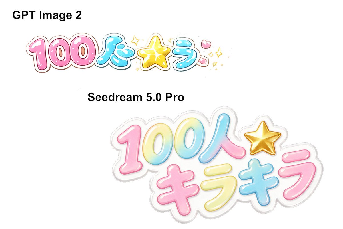
日本の「カワイイ」ロゴモデル比較
Creates a clean white comparison graphic showing two AI model labels and two glossy Japanese kawaii bubble-letter logo outputs.
回視聴73
いいね0
コメント0
シェア0
ブックマーク0
引用0
Goal: Create a clean side-by-side comparison graphic on a plain white background showing two AI image model outputs of the same Japanese kawaii logo prompt.

Canvas: Wide 3:2 landscape canvas, approximately 1152 × 768 px, with lots of empty white space and no border or watermark.

Layout: Place two bold black model labels and two colorful logo samples. In the upper-left area, add the label “GPT Image 2” in large bold sans-serif black text. Below it, place a smaller glossy Japanese bubble-letter logo reading {argument name="logo text" default="100人キラキラ"}, arranged mostly in one horizontal line. In the middle-left area, add the label {argument name="second model label" default="Seedream 5.0 Pro"} in bold black sans-serif text. Below and to the right of that label, place a larger, sticker-like version of the same logo, occupying the lower-right half of the canvas.

Text and objects count: Include exactly 2 black model labels: “GPT Image 2” and “Seedream 5.0 Pro”. Include exactly 2 colorful Japanese logo renderings. The upper logo should have 6 main text/symbol parts: pink “100”, blue “人”, yellow star symbol, blue “ラ”, pink dakuten-like mark, and small sparkle decorations. The lower logo should have 7 main text/symbol parts: gradient “100”, blue-pink “人”, gold star symbol, pink “キ”, yellow “ラ”, blue “キ”, and pink “ラ”.

Visual style: Cute Japanese idol merchandise aesthetic, glossy inflated bubble lettering, rounded thick strokes, pastel candy colors, white highlights, subtle inner gradients, thin colored outlines, and soft gray/white sticker borders. Use {argument name="color palette" default="pink, cyan blue, lemon yellow, gold, and white"}. The lower logo should look more polished, larger, layered, and semi-translucent like a die-cut acrylic sticker with a soft gray shadow. The upper logo should look flatter and slightly less refined, with more small sparkles around the star.

Constraints: Keep the background completely white, preserve the comparison composition, use crisp readable black labels, avoid extra captions, avoid photorealistic objects, and do not add any people or scenery.


