Dark Yunnan Cuisine Franchise Deck
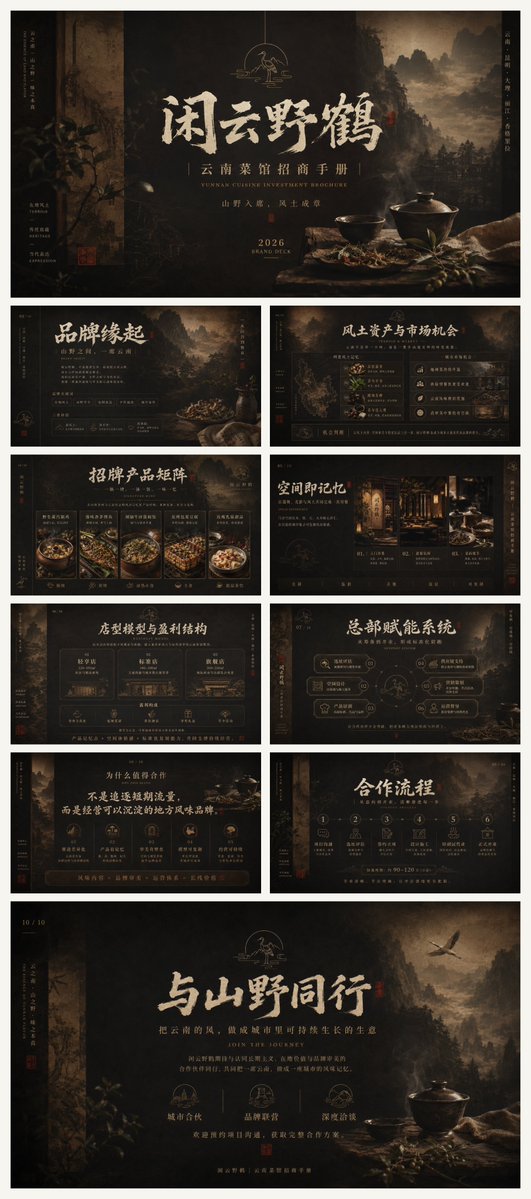
A premium 10-slide Chinese-style investment brochure deck for a Yunnan cuisine restaurant brand, designed for franchise recruitment and brand presentations.
プロンプト
目標: {argument name="brand name" default="闲云野鹤"}というプレミアム雲南料理ブランドのための完全な10スライドワイドスクリーンPowerPointスタイルの投資家向けパンフレットを作成する。暗いシネマティック中国の風景美学を持ち、フランチャイズ募集とブランドストーリーテリングのプレゼンテーション資料として適している。

キャンバス: 16:9水平スライド、正確に10個の異なるスライドを持つ完全なパンフレットデッキプレビューとして提示。深い黒、スモーキーチャーコール、エイジドブロンズ、ミュートゴールド、ティーブラウン、温かいランタンのハイライトを使用。広いマージン、細いゴールド分割線、縦のサイドキャプション、微かなページ番号、洗練されたエディトリアル间距を追加。

ビジュアルスタイル: 古代中国の水墨画とリアルなダークフードフォトグラフィーを融合させ、霧深い森、崖のシルエット、古い紙のテクスチャ、焦げたエッジ、微かなグレーン、ローキーライティング、プレミアムレストラン雰囲気、宋/明朝にインスパイアされたタイポグラフィ、大きく表現的な中国筆書道タイトル、小さなエレガントなセリフ英語サブタイトル、ブロンズラインアイコン、ミュートレッドの封印スタンプ、シネマティックな被写界深度。全体の雰囲気: ミステリアス、洗練、自然、職人、ハイエンド、投資可能。

ブランドとテーマ: パンフレットは{argument name="cuisine focus" default="雲南野生キノコと山岳料理"}に焦点を当てた成長中の地域料理ブランドを宣伝。コアメッセージ: 自然、文化、風味、スケーラブルなオペレーションに根ざしたブランドに参加。メインスローガン {argument name="main slogan" default="与山野同行"} を最終スライドに、パンフレットサブタイトル {argument name="brochure subtitle" default="云南菜馆招商手册"} をカバーに使用。

スライド数とレイアウト: 正確に10個のスライドを作成し、それぞれが異なりながら同じダークビジュアルシステムで統一:
1. カバースライド: 中央に大きく筆書道タイトル “闲云野鹤”、サブタイトル “云南菜馆招商手册”、小さな英語のライン “YUNNAN CUISINE INVESTMENT BROCHURE”、年 “2026”、山渓の背景、鶴のエンブレムが上、右下に質素なテーブル、陶器のボウル、蓋付き鍋、ハーブ、リネンクロス。
2. ブランド起源スライド: タイトル “品牌缘起”、レイヤード山岳背景、導入ブランドストーリーテキストブロック、小さな創業者/哲学ノート、装飾的な縦サイドテキスト、小さな赤い封印。
3. 機会スライド: タイトル “风土资产与市场机会”、左に地図のような雲南イラスト、右に構造化された分析カードとデータスタイルパネル、地形、素材、消費者、ビジネスポテンシャルの小さなアイコン。
4. 製品マトリックススライド: タイトル “招牌产品矩阵”、下半分に正確に5つの製品カードを配置し、各カードは1つのダークグルメ料理写真と短い中国語ラベル; 温かいハイライトとゴールドカードフレームを使用。
5. スペースメモリースライド: タイトル “空间即记忆”、木製スクリーン、ランタン、食器、プライベートダイニングムードの雰囲気あるレストランインテリアフォトグラフィー; 下に正確に3つのフィーチャーブロックを含み、入り口、ダイニングルーム、プライベートルーム体験用。
6. 店舗モデルと収益構造スライド: タイトル “店型模型与盈利结构”、中央に正確に3つのメイン店舗フォーマットカード、下の行に投資、エリア、スタッフ、テーブル数、オペレーション指標の小さな指標アイコン。
7. 本部賦能システムスライド: タイトル “总部赋能系统”、中心円形システム図に鶴/ブランドエンブレム、正確に6つの丸みある能力ノードに接続: 訓練、サプライチェーン、マーケティング、サイト選定、オペレーション、製品R&D。
8. 協力理由スライド: タイトル “为什么值得合作”、ヘッドライン “不是追逐短暂流量,而是经营可以沉淀的地方风味品牌” を強調、正確に6つの理由アイコン/カードを一列に、底辺近くに長いブロンズ行動喚起バーで終了。
9. 協力プロセススライド: タイトル “合作流程”、相談からオープン/オペレーションサポートまでの正確に6つの番号付きステップ、各ステップに最小限のブロンズアイコン、中央に水平に配置。
10. クロージングスライド: 大きな筆書道スローガン “与山野同行”、地域風味で長期的な生活を築くことについてのサブタイトル、右上に飛ぶ鶴、山岳森林背景、右下に質素なボウルと鍋のスタンドライフ、段落の下に正確に3つの中央アイコンステートメント: 都市成長、ブランド接続、地域風味。

テキスト処理: 中国語をメインの可視テキストとして使用し、時折小さな英語サブタイトル such as “BRAND STORY”、“MARKET OPPORTUNITY”、“PRODUCT MATRIX”、“SPACE MEMORY”、“STORE MODEL”、“SUPPORT SYSTEM”、“COOPERATION PROCESS”、“JOIN THE JOUR Journey” を使用。テキストを現実的に保ちながら過度に詰め込まず; 読みやすい見出しと視覚的に信頼できる本文コピーを優先。

構図の制約: 明るいモダンカラーなし、カートーンスタイルなし、一般的なコーポレートブルーなし、西洋のファストフード感なし、プラスチックのようなフードなし、雑然としたUIなし。すべての10スライドで一貫したブランディングを維持し、同じロゴエンブレム、サイドナビゲーションマーク、ページ番号、ブロンズライン、ダークな雰囲気の背景、プレミアムパンフレット美学を持つ。
機械翻訳 — この作品を生成したのは元のプロンプトです。
元のプロンプト
Goal: Create a complete 10-slide widescreen PowerPoint-style招商手册 / brand investment brochure for a premium Yunnan cuisine brand named {argument name="brand name" default="闲云野鹤"}, with a dark cinematic Chinese landscape aesthetic, suitable as presentation materials for franchise recruitment and brand storytelling.

Canvas: 16:9 horizontal slides, presented as a full brochure deck preview with exactly 10 distinct slides. Use deep black, smoky charcoal, aged bronze, muted gold, tea-brown, and warm lantern highlights. Add generous margins, thin gold divider lines, vertical side captions, subtle page numbers, and refined editorial spacing.

Visual style: Ancient Chinese ink-wash mountains blended with realistic dark food photography, misty forests, cliff silhouettes, old paper texture, burnt edges, faint grain, low-key lighting, premium restaurant atmosphere, Song/Ming dynasty inspired typography, large expressive Chinese brush-calligraphy titles, small elegant serif English subtitles, bronze line icons, seal stamps in muted red, and cinematic depth of field. Overall mood: mysterious, refined, natural, artisanal, high-end, and investment-ready.

Brand and theme: The brochure promotes a growing regional cuisine brand focused on {argument name="cuisine focus" default="Yunnan wild mushroom and mountain cuisine"}. Core message: joining a brand rooted in nature, culture, flavor, and scalable operations. Use the main slogan {argument name="main slogan" default="与山野同行"} on the final slide and the brochure subtitle {argument name="brochure subtitle" default="云南菜馆招商手册"} on the cover.

Slide count and layout: Create exactly 10 slides, each visibly different but unified by the same dark visual system:
1. Cover slide: huge centered brush-calligraphy title “闲云野鹤”, subtitle “云南菜馆招商手册”, small English line “YUNNAN CUISINE INVESTMENT BROCHURE”, year “2026”, mountain valley background, crane emblem above, rustic table at lower right with a ceramic bowl, lidded pot, herbs, and linen cloth.
2. Brand origin slide: title “品牌缘起”, layered mountain background, introductory brand story text blocks, small founder/philosophy notes, decorative vertical side text, and a small red seal.
3. Market opportunity slide: title “风土资产与市场机会”, map-like Yunnan illustration on the left, structured analysis cards and data-style panels on the right, small icons for terrain, ingredients, consumers, and business potential.
4. Product matrix slide: title “招牌产品矩阵”, exactly 5 product cards across the lower half, each card showing one dark gourmet dish photo with a short Chinese label; use warm highlights and gold card frames.
5. Spatial memory slide: title “空间即记忆”, atmospheric restaurant interior photography with wood screens, lanterns, tableware, and private dining mood; include exactly 3 feature blocks along the bottom for entrance, dining room, and private room experience.
6. Store model and profit structure slide: title “店型模型与盈利结构”, exactly 3 main store-format cards across the center, plus a lower row of small metric icons for investment, area, staff, table count, and operating indicators.
7. Headquarters empowerment system slide: title “总部赋能系统”, central circular system diagram with the crane/brand emblem, connected to exactly 6 rounded capability nodes for training, supply chain, marketing, site selection, operations, and product R&D.
8. Reasons to cooperate slide: title “为什么值得合作”, headline emphasizing “不是追逐短暂流量,而是经营可以沉淀的地方风味品牌”, exactly 6 reason icons/cards in a row, ending with a long bronze call-to-action bar near the bottom.
9. Cooperation process slide: title “合作流程”, exactly 6 numbered steps from consultation to opening/operation support, each with a minimal bronze icon, arranged horizontally across the middle.
10. Closing slide: large brush-calligraphy slogan “与山野同行”, subtitle about building a long-term life with regional flavor, crane flying in the upper right, mountain forest background, rustic bowl and pot still life at lower right, exactly 3 centered icon statements below the paragraph: city growth, brand connection, and regional flavor.

Text treatment: Use Chinese as the main visible text, with occasional small English subtitles such as “BRAND STORY”, “MARKET OPPORTUNITY”, “PRODUCT MATRIX”, “SPACE MEMORY”, “STORE MODEL”, “SUPPORT SYSTEM”, “COOPERATION PROCESS”, and “JOIN THE JOURNEY”. Keep text realistic but not overcrowded; prioritize legible headings and visually credible body copy.

Composition constraints: No bright modern colors, no cartoon style, no generic corporate blue, no Western fast-food feeling, no plastic-looking food, no cluttered UI. Maintain consistent branding across all 10 slides, with the same logo emblem, side navigation marks, page numbers, bronze lines, dark atmospheric backgrounds, and premium brochure aesthetics.