Japanese Cut Flower Soda Care Infographic
Generates a polished Japanese one-page infographic explaining how to use carbonated drinks for cut flowers, including benefits, risks, ratios, steps, and care tips.
프롬프트
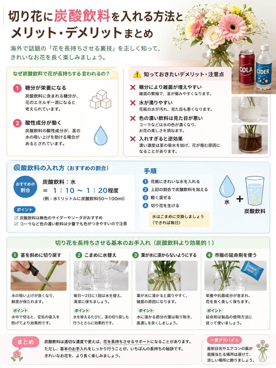
목표: {argument name="headline text" default="切り花に炭酸飲料を入れる方法とメリット・デメリットまとめ"}를 요약한 세로형 일본어 교육용 인포그래픽을 제작합니다. 절화 화병 물에 탄산음료를 첨가하는 방법과 그 효능, 단점, 권장 희석 비율, 절차 및 더 나은 기본 관리 방법을 설명하세요.

캔버스: 세로형 4:5 비율 인포그래픽, 따뜻한 오프 화이트 배경에 깔끔한 잡지 스타일 레이아웃, 부드러운 파스텔 테두리, 둥근 정보 카드, 은은한 그림자, 친근한 가정 원예 분위기. 플랫 벡터 아이콘과 작은 실사 사진 패널을 균형 있게 사용하세요. 주요 색상: 코랄 핑크, 초콜릿 브라운, 민트 그린, 페일 옐로우, 스카이 블루, 라이트 그레이.

상단 헤더: 두 가지 색상의 크고 굵은 일본어 헤드라인을 배치하고, 탄산음료 관련 문구는 코랄 핑크로, 나머지는 다크 브라운으로 강조하세요. 그 아래에 녹색의 작은 부제목을 추가하세요: {argument name="subtitle text" default="海外で話題の「花を長持ちさせる裏技」を正しく知って、きれいなお花を長く楽しみましょう。"}. 우측 상단에는 나무 테이블 위 투명 유리 화병에 담긴 실사 스타일의 꽃다발(핑크 거베라, 크림색 장미, 작은 흰색 필러 꽃, 그린 소재)을 배치하세요. 그 옆에 정확히 2개의 음료 병/캔을 보여주세요: “COLA”라고 적힌 빨간색 콜라 캔 1개와 “CIDER”라고 적힌 파란색 사이다 병 1개. 그 아래에는 화병 물의 실사 수직 패널 2개를 배치하세요: 맑은 물 클로즈업 1개와 갈색/착색된 물 클로즈업 1개.

상단 주요 콘텐츠 영역: 정확히 2개의 나란한 둥근 카드를 사용하세요.
카드 1(왼쪽, 페일 옐로우 제목 바): 제목 {argument name="benefits section title" default="なぜ炭酸飲料で花が長持ちする言われるの?"}. 핑크색 원형 숫자 배지가 달린 2개의 효능 항목을 포함하세요: 1) “糖分が栄養になる” (설탕이 영양분이 됨) - 각설탕 아이콘과 함께 탄산음료의 당분이 꽃의 에너지원으로 사용될 수 있다는 설명; 2) “酸性成分が働く” (산성 성분의 작용) - 파란색 물방울 아이콘과 함께 산성이 수분 흡수를 도울 수 있다는 설명.
카드 2(오른쪽, 노란색 경고 삼각형 아이콘이 있는 페일 핑크 제목 바): 제목 “知っておきたいデメリット・注意点”. 빨간색 X 아이콘이 있는 4개의 경고 항목을 포함하세요: 1) 당분이 잡균을 번식시켜 줄기를 썩게 할 수 있음; 2) 물이 쉽게 탁해져 보기 좋지 않음; 3) 콜라처럼 색이 진한 음료는 물을 착색시켜 미관을 해칠 수 있음; 4) 과도한 농도는 오히려 수분 흡수를 방해하고 시들게 할 수 있음. 텍스트는 간결한 일본어로 작성하세요.

중앙 파란색 안내 밴드: 파란색 테두리와 연한 파란색 배경의 넓은 둥근 직사각형을 만드세요. 두 개의 열로 나누세요.
왼쪽 열 제목: “炭酸飲料の入れ方(おすすめの割合)”. 파란색 원형 라벨 “おすすめの割合”와 큰 공식 “炭酸飲料:水 = 1:10 ~ 1:20程度”를 포함하고, 작은 예시 텍스트 “例:水1リットルに炭酸飲料50〜100ml”를 넣으세요. “ポイント” 하위 섹션에 정확히 2개의 체크 표시 글머리 기호를 추가하세요: 가급적 인공 색소가 없는 투명한 사이다/탄산을 사용할 것; 콜라 같은 진한 음료는 소량으로도 물을 착색시킬 수 있음.
오른쪽 열 제목: “手順”. 파란색 원형 숫자 4단계를 포함하세요: 1) 화병에 깨끗한 물을 넣는다; 2) 위 비율로 탄산음료를 넣는다; 3) 가볍게 섞는다; 4) 절화를 꽂는다. 연한 노란색 메모 상자를 추가하세요: “水はこまめに交換しましょう(できれば毎日)”. 맨 오른쪽에는 큰 수식 일러스트를 추가하세요: 물방울 아이콘 “水” + 기포가 있는 노란색 액체 잔 “炭酸飲料”.

하단 녹색 관리 섹션: 녹색 헤더 제목이 있는 넓은 둥근 직사각형: {argument name="care section title" default="切り花を長持ちさせる基本のお手入れ(炭酸飲料より効果的!)"}. 내부에 4개의 동일한 관리 카드를 가로로 배치하세요. 각 카드에는 녹색 숫자 원, 짧은 일본어 제목, 실사 썸네일, 설명 텍스트, 녹색 “ポイント” 라벨이 포함되어야 합니다. 4개의 카드: 1) “茎を斜めに切り戻す” (줄기를 사선으로 자르기), 칼로 줄기를 사선으로 자르는 손 사진, 수분 흡수와 신선도 설명, 포인트: 공기 유입 방지를 위해 물속에서 자르기; 2) “こまめに水替え” (자주 물 갈아주기), 유리 화병에 물을 붓는 사진, 매일 또는 1~2일마다 물 교체 설명, 포인트: 물 갈 때 줄기 다시 자르기; 3) “葉が水に浸からないようにする” (잎이 물에 잠기지 않게 하기), 화병 속 줄기와 잎 사진, 잠긴 잎은 썩고 세균을 유발한다는 설명, 포인트: 물에 잠기는 잎 제거 및 통풍 개선; 4) “市販の延命剤を使う” (시판 절화 수명 연장제 사용), 화병 옆 파란색 꽃 영양제 패킷 사진, 영양분과 항균 성분 설명, 포인트: 제품 설명서 따르기.

하단 요약 스트립: 2개의 둥근 상자를 사용하세요. 왼쪽의 더 큰 페일 핑크 상자에는 “まとめ” 라벨, 작은 꽃 아이콘, 적절한 농도로 사용 시 탄산음료가 꽃의 수명에 도움이 될 수 있으나 기본적인 관리가 가장 중요하다는 텍스트를 넣으세요. 오른쪽의 작은 페일 핑크 조언 상자에는 “一言アドバイス” 라벨, 작은 화병 아이콘, 직사광선과 에어컨 바람을 피하고 서늘한 곳에 보관하라는 텍스트를 넣으세요.

스타일 제약: 일본어 타이포그래피는 읽기 쉽고 친근하며 제목은 굵게 처리하세요; 깔끔한 그리드 정렬과 넉넉한 여백을 사용하세요. 지정된 개수를 초과하는 추가 섹션이나 반복 항목은 넣지 마세요. 워터마크, QR 코드, 인물, “COLA” 및 “CIDER” 라벨 외의 브랜드 로고는 사용하지 마세요.
기계 번역 — 실제 결과물을 만든 것은 원문 프롬프트입니다.
원문 프롬프트
Goal: Create a vertical Japanese educational infographic summarizing {argument name="headline text" default="切り花に炭酸飲料を入れる方法とメリット・デメリットまとめ"}, explaining how to add carbonated soft drinks to cut flower vase water, with benefits, drawbacks, recommended dilution, procedure, and better basic care methods.

Canvas: Portrait 4:5 infographic, clean magazine-style layout on a warm off-white background, soft pastel borders, rounded information cards, subtle shadows, friendly household gardening aesthetic. Use a balanced mix of flat vector icons and small realistic photo panels. Main colors: coral pink, chocolate brown, mint green, pale yellow, sky blue, and light gray.

Top header: Large bold Japanese headline in two colors, with the phrase about carbonated drinks emphasized in coral pink and the rest in dark brown. Under it, add a smaller green subtitle: {argument name="subtitle text" default="海外で話題の「花を長持ちさせる裏技」を正しく知って、きれいなお花を長く楽しみましょう。"}. On the upper right, place a realistic photo-style bouquet in a clear glass vase on a wooden table, with pink gerbera daisies, cream roses, small white filler flowers, and greenery. Beside it show exactly 2 drink bottles/cans: one red cola can labeled “COLA” and one blue cider bottle labeled “CIDER”. Below them show exactly 2 small vertical photo panels of vase water: one clear water close-up and one brown/tinted water close-up.

Main upper content area: Use exactly 2 side-by-side rounded cards.
Card 1, left, pale yellow title bar: title text {argument name="benefits section title" default="なぜ炭酸飲料で花が長持ちする言われるの?"}. Include exactly 2 numbered benefit rows with pink circular number badges: 1) “糖分が栄養になる” with a simple icon of stacked sugar cubes, and explanatory small text saying sugar in soda may be used as flower energy; 2) “酸性成分が働く” with a blue water drop icon, and small text saying acidity may help water uptake.
Card 2, right, pale pink title bar with a yellow warning triangle icon: title “知っておきたいデメリット・注意点”. Include exactly 4 warning rows, each with a red X icon: 1) sugar can encourage miscellaneous bacteria and make stems rot; 2) water becomes cloudy easily and looks bad; 3) dark-colored drinks such as cola can color the water and reduce visual beauty; 4) too much can have the opposite effect because excessive concentration may worsen water uptake and cause wilting. Keep text concise and Japanese.

Middle blue instruction band: Create one wide rounded rectangle with a blue outline and pale blue fill. Divide into two columns.
Left column title: “炭酸飲料の入れ方(おすすめの割合)”. Include a blue circular label “おすすめの割合” and a large formula: “炭酸飲料:水 = 1:10 ~ 1:20程度”, with small example text “例:水1リットルに炭酸飲料50〜100ml”. Add a “ポイント” subsection with exactly 2 checkmark bullet points: use clear cider/soda without artificial color when possible; dark drinks such as cola can color the water even in small amounts.
Right column title: “手順”. Include exactly 4 numbered steps in blue circles: 1) put clean water in the vase; 2) add carbonated drink at the above ratio; 3) mix lightly; 4) arrange cut flowers. Add a pale yellow note box: “水はこまめに交換しましょう(できれば毎日)”. On the far right add a large simple equation illustration: water drop icon labeled “水” plus a glass with bubbly yellow liquid labeled “炭酸飲料”.

Lower green care section: A wide rounded rectangle with a green header title: {argument name="care section title" default="切り花を長持ちさせる基本のお手入れ(炭酸飲料より効果的!)"}. Inside, show exactly 4 equal care cards in a row, each with a green numbered circle, a short Japanese title, a realistic photo thumbnail, explanatory text, and a green “ポイント” label. The 4 cards must be: 1) “茎を斜めに切り戻す”, photo of a hand cutting a green stem diagonally with a knife, explain better water absorption and freshness, point: cut underwater to prevent air entry; 2) “こまめに水替え”, photo of water being poured into a glass vase, explain changing water daily or every 1–2 days, point: recut stems when changing water; 3) “葉が水に浸からないようにする”, photo of stems and leaves inside a vase, explain submerged leaves rot and cause bacteria, point: remove leaves below the waterline and improve ventilation; 4) “市販の延命剤を使う”, photo of a blue flower food packet near a vase, explain it contains nutrients and antibacterial ingredients, point: follow product instructions.

Bottom summary strip: Use two rounded boxes. Left larger pale pink box with label “まとめ”, a small flower icon, and text explaining that carbonated drinks may support flower longevity when used at the proper concentration, but thorough basic care is the most important secret. Right smaller pale pink advice box with label “一言アドバイス”, small vase-and-flower icon, and text advising to avoid direct sunlight and air-conditioner wind, and keep flowers in a cool place.

Style constraints: Japanese typography must be legible, friendly, and bold for headings; use clean grid alignment and generous spacing. Do not add extra sections or extra repeated items beyond the specified counts. Avoid watermark, QR code, people, or brand logos other than the simple “COLA” and “CIDER” labels.