Expressive Graphite Pencil Study
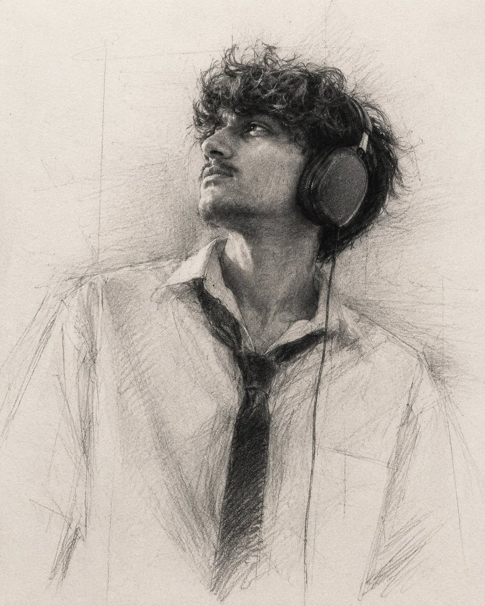
A sophisticated prompt designed to generate a high-contrast graphite drawing with intentional unfinished elements, mimicking a museum-quality academic sketch.
프롬프트
질감이 살아있는 고급 드로잉 용지 위에 그려진 매우 표현력이 풍부한 흑연 연필 초상화, 4:5 비율.

약 85~90% 정도만 완성된 느낌으로 드로잉을 생성하십시오. 의도적으로 미완성된 부분, 열린 윤곽선, 보조선, 그리고 예술적 결정이 드러나는 흔적을 남겨야 합니다. 초상화는 완전히 묘사된 일러스트레이션보다는 박물관 수준의 흑연 습작처럼 느껴져야 합니다.

극도로 풍부한 {argument name="shading intensity" default="깊은 흑연의 검은색"}을 사용하여 극적인 명암 대비를 연출하십시오. 강렬한 {argument name="pencil grade" default="8B~14B"} 흑연을 사용하여 강력한 검은색 초점을 만들고, 보는 이의 시선을 즉각적으로 사로잡는 대담한 그림자 덩어리를 형성하십시오. 가장 어두운 명암은 디지털 방식으로 뭉개진 느낌 없이 밀도 있고 벨벳처럼 부드러우며 입체적으로 느껴져야 합니다.

모든 세부 사항을 동일하게 묘사하는 대신, 얼굴의 가장 표현력이 풍부한 특징(특히 눈, 눈썹, 콧대, 수염 질감, 헤어라인, 얼굴 구조)에만 선택적으로 강조를 두십시오. 이러한 핵심 영역에 최고 수준의 디테일과 대비를 적용하십시오.

나머지 영역은 느슨한 흑연 자국, 불완전한 명암, 끊어진 윤곽선, 미완성된 형태로 점진적으로 사라지게 하되, 80% 미만으로 묘사하십시오. 초상화의 넓은 영역은 의도적으로 완전히 묘사하기보다 암시적으로 남겨두어, 여백과 보는 이의 상상력이 이미지를 완성하도록 하십시오.

자신감 있고 에너지 넘치는 연필 터치를 사용하고 필압에 자연스러운 변화를 주십시오. 층을 이룬 흑연, 교차 해칭, 깃털 같은 명암, 불규칙한 선 작업, 즉흥적인 스케치 제스처를 통해 형태를 구축하십시오.

눈에 보이는 흑연 가루가 종이 위에 부드럽게 퍼져 과하게 블렌딩되지 않으면서도 미묘한 분위기 전환을 만들어내야 합니다. 사실적인 흑연 결, 목탄 같은 먼지, 우연한 얼룩, 지우개로 지운 하이라이트, 종이 섬유, 탁한 흰색, 그리고 손으로 그린 듯한 진정한 불완전함을 포함하십시오.

머리카락은 날카로운 가닥과 느슨한 흑연 덩어리가 교차하는 표현력 있는 겹침 터치로 묘사하십시오. 수염은 매끄러운 묘사 대신 층을 이룬 거친 흑연 자국을 사용하여 유기적이고 거칠며 풍부한 질감이 느껴지도록 하십시오.

극적인 고대비 조명 설정을 유지하십시오. 윤곽선보다는 명암 덩어리를 통해 초상화를 정의하십시오. 깊은 검은색이 구도를 잡아주고, 부드러운 중간 톤은 미완성된 종이 질감 속으로 점진적으로 사라져야 합니다.

전반적인 톤 분위기는 {argument name="tonal palette" default="차가운 중성 흑연 톤"}과 풍부한 목탄 검은색, 따뜻한 종이 하이라이트를 사용하는 전통적인 학구적 흑연 거장의 드로잉을 닮아야 합니다. 평평한 회색 묘사는 피하십시오. 구도 전반에 걸쳐 강렬한 검은색 강조와 선명한 명암 분리를 유지하십시오.

전통적인 흑연 드로잉, 박물관 수준의 연필 예술, 표현주의적 사실주의, 선택적 묘사, 극적인 키아로스쿠로(명암법), 강력한 검은색 초점, 사실적인 흑연 질감, 입체적인 종이 표면, 미완성된 예술적 과정, 수작업 느낌, 순수 미술 스케치북 미학, 고대비, 깊은 흑연의 검은색, 눈에 보이는 흑연 가루.
기계 번역 — 실제 결과물을 만든 것은 원문 프롬프트입니다.
원문 프롬프트
A highly expressive graphite pencil portrait on textured fine art drawing paper, 4:5 aspect ratio.

Create the drawing with approximately 85–90% completion, intentionally leaving unfinished passages, open contours, construction lines, and visible artistic decisions. The portrait should feel like a museum-quality graphite study rather than a fully rendered illustration.

Use extremely rich, {argument name="shading intensity" default="deep graphite blacks"} with dramatic tonal contrast. Build powerful black focal points using heavy {argument name="pencil grade" default="8B–14B"} graphite, creating bold shadow masses that immediately attract the viewer's eye. The darkest values should feel dense, velvety, and tactile without appearing digitally crushed.

Instead of rendering every detail equally, selectively emphasize only the most expressive features of the face—especially the eyes, eyebrows, nose bridge, beard texture, hairline, and facial structure. Allow these key areas to receive the highest level of detail and contrast.

The remaining areas should gradually dissolve into loose graphite marks, incomplete shading, broken contours, and unfinished forms, with less than 80% rendering. Large areas of the portrait should intentionally remain suggested rather than fully described, allowing negative space and the viewer's imagination to complete the image.

Use confident, energetic pencil strokes with natural variation in pressure. Build form through layered graphite, cross-hatching, feathered shading, irregular line work, and spontaneous sketch gestures.

Visible graphite powder should softly spread across the paper, producing subtle atmospheric transitions without becoming overly blended. Include realistic graphite grain, charcoal-like dust, accidental smudges, erased highlights, paper fibers, dirty whites, and authentic hand-drawn imperfections.

Hair should be rendered with expressive overlapping strokes that alternate between razor-sharp strands and loose graphite masses. Facial hair should appear organic, rough, and richly textured using layered broken graphite marks instead of smooth rendering.

Maintain a dramatic high-contrast lighting setup. Define the portrait primarily through tonal masses rather than outlines. Deep blacks should anchor the composition while soft midtones gradually disappear into unfinished paper texture.

The overall tonal mood should resemble a traditional academic graphite master drawing using {argument name="tonal palette" default="cool neutral graphite tones"} with rich charcoal blacks and warm paper highlights. Avoid flat gray rendering. Preserve strong black accents and crisp value separation throughout the composition.

Traditional graphite drawing, museum-quality pencil art, expressive realism, selective rendering, dramatic chiaroscuro, powerful black focal points, authentic graphite texture, tactile paper surface, unfinished artistic process, handmade appearance, fine art sketchbook aesthetic, high contrast, deep graphite blacks, visible graphite dust.