Vintage Retro Screen-Print Poster
A highly structured prompt for creating premium vertical retro screen-print posters with a travel or cultural aesthetic, featuring stippled textures and bold typography.
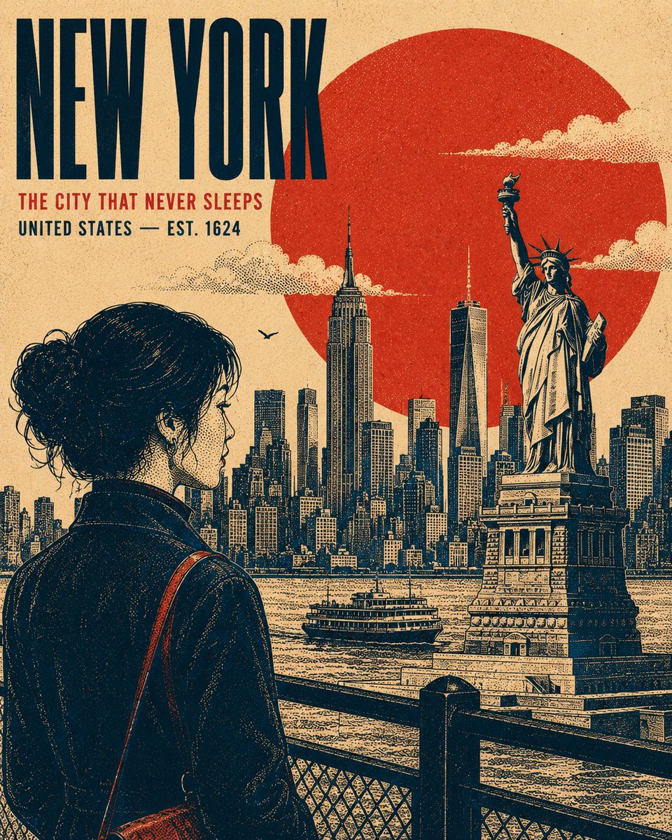
Prompt
Crie uma ilustração de pôster vertical 4:5 premium em serigrafia retrô centrada em {argument name="subject" default="[ASSUNTO / MARCO / CIDADE / ÉPOCA]"}. A composição deve transmitir a sensação de uma impressão cultural ou de viagem vintage refinada, mantendo-se adaptável a qualquer local, período histórico, marco ou assunto. TIPOGRAFIA: Coloque o título principal "{argument name="main title" default="[TÍTULO PRINCIPAL]"}" em uma fonte sem serifa condensada, em negrito e maiúsculas, posicionada em uma área equilibrada de espaço negativo. Adicione uma linha de apoio menor "{argument name="headline" default="[SUBTÍTULO / LOCAL / DATA]"}" abaixo dele. Mantenha uma forte hierarquia tipográfica, espaçamento contido e um caráter autêntico de pôster de arquivo. ASSUNTO PRINCIPAL: Destaque [ASSUNTO PRINCIPAL] como o elemento visual dominante, posicionado no terço inferior ou lateral da composição. Use uma pose, silhueta ou perfil distinto que comunique o caráter do assunto. Inclua detalhes definidores cuidadosamente renderizados, contornos naturais, características expressivas, vestuário ou detalhes arquitetônicos e destaques sutis, sem tornar a arte fotorrealista. ÂNCORA GEOMÉTRICA: Introduza uma forma geométrica simples e ousada atrás ou ao redor do assunto principal para criar separação visual e estabelecer um forte ponto focal gráfico. FUNDO: Construa o ambiente como vários planos gráficos planos e sobrepostos, em vez de uma cena realista convencional. Use elementos reconhecíveis associados a [LOCAL / ASSUNTO] — silhuetas distantes, formas arquitetônicas, detalhes estruturais, vegetação, terreno, elementos atmosféricos ou motivos culturais. Evite um ponto de fuga forte. Construa profundidade através de formas sobrepostas, escala, linhas e densidade tonal. Renderize nuvens, fumaça, névoa, folhagem ou detalhes atmosféricos como grupos de pontilhismo controlados, quando apropriado. ESTILO DE RENDERIZAÇÃO: Estética autêntica de pôster em serigrafia vintage. Crie toda a modelagem tonal exclusivamente através de pontilhismo, padrões de meio-tom e densidade de pontos variável — pontos concentrados para sombras e pontos esparsos para destaques. Sem gradientes suaves, aerografia, sombreamento fotorrealista ou renderização digital 3D. Use linhas de contorno nítidas com peso visual consistente, deslocamentos de registro sutis estilo riso, bordas de tinta imperfeitas, granulação de papel natural e textura de impressão tecida leve. O resultado deve parecer fisicamente impresso, em vez de renderizado digitalmente. SISTEMA DE CORES: Use exatamente quatro cores de alto contraste cuidadosamente selecionadas e apropriadas ao assunto: [COR 1], [COR 2], [COR 3], [COR 4]. Não introduza tons adicionais. Gere valores tonais intermediários exclusivamente através da densidade de pontilhismo, sobreposição de meio-tom e cobertura de tinta, nunca adicionando novas cores. COMPOSIÇÃO: Forte equilíbrio editorial, hierarquia focal clara, espaço negativo generoso, profundidade em camadas, design de silhueta ousado, proporções autênticas de design gráfico vintage e densidade visual cuidadosamente controlada. Mantenha a arte sofisticada, colecionável e adequada para um pôster cultural ou de viagem premium. SAÍDA: 4
Tradução automática — o prompt original é o que gerou este resultado.
Prompt original
Create a premium 4:5 vertical retro screen-print poster illustration centered on {argument name="subject" default="[SUBJECT / LANDMARK / CITY / ERA]"}. The composition should feel like a refined vintage travel or cultural print, while remaining adaptable to any location, historical period, landmark, or subject. TYPOGRAPHY: Place the primary title "{argument name="main title" default="[MAIN TITLE]"}" in a bold, condensed uppercase sans-serif, positioned within a balanced area of negative space. Add a smaller supporting line "{argument name="headline" default="[SECONDARY HEADLINE / LOCATION / DATE]"}" beneath it. Maintain strong typographic hierarchy, restrained spacing, and an authentic archival-poster character. MAIN SUBJECT: Feature [PRIMARY SUBJECT] as the dominant visual element, positioned within the lower or side third of the composition. Use a distinctive pose, silhouette, or profile that communicates the character of the subject. Include carefully rendered defining details, natural contours, expressive features, clothing or architectural details, and subtle highlights without making the artwork photorealistic. GEOMETRIC ANCHOR: Introduce one bold, simple geometric shape behind or around the main subject to create visual separation and establish a strong graphic focal point. BACKGROUND: Construct the environment as several flat, layered graphic planes rather than a conventional realistic scene. Use recognizable elements associated with [LOCATION / SUBJECT] — distant silhouettes, architectural forms, structural details, vegetation, terrain, atmospheric elements, or cultural motifs. Avoid a strong vanishing point. Build depth through overlapping shapes, scale, linework, and tonal density. Render clouds, smoke, mist, foliage, or atmospheric details as controlled stippled clusters where appropriate. RENDERING STYLE: Authentic vintage screen-print / silkscreen poster aesthetic. Create all tonal modeling exclusively through stippling, halftone patterns, and varying dot density — concentrated dots for shadows and sparse dots for highlights. No smooth gradients, airbrushing, photorealistic shading, or digital 3D rendering. Use crisp contour lines with consistent visual weight, subtle riso-style registration shifts, imperfect ink edges, natural paper grain, and faint woven-print texture. The result should feel physically printed rather than digitally rendered. COLOR SYSTEM: Use exactly four carefully selected high-contrast colors appropriate to the subject: [COLOR 1], [COLOR 2], [COLOR 3], [COLOR 4]. Do not introduce additional hues. Generate intermediate tonal values exclusively through stipple density, halftone overlap, and ink coverage, never by adding new colors. COMPOSITION: Strong editorial balance, clear focal hierarchy, generous negative space, layered depth, bold silhouette design, authentic vintage graphic-design proportions, and carefully controlled visual density. Keep the artwork sophisticated, collectible, and suitable for a premium travel or cultural poster. OUTPUT: 4✨ Gerar Salvar Publicação original Abrir no Hitboard