City Letters Travel Poster
ยอดดู20,157
ถูกใจ284
ความเห็น3
แชร์27
บุ๊กมาร์ก232
อ้างอิง14
[CITY] = KTOKYO
Create a 10-second premium travel-poster style video for [CITY].

Use a soft ivory poster background, a thin moving panoramic strip at the top, and a huge bold centered sans-serif title: “[CITY]”.

For most of the video, keep the typography fixed and show moving city scenes inside the letters.
The top panoramic strip should also gently move.
Let the viewer spend enough time watching the world inside the typography.

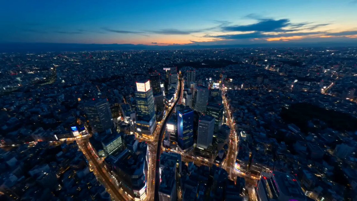
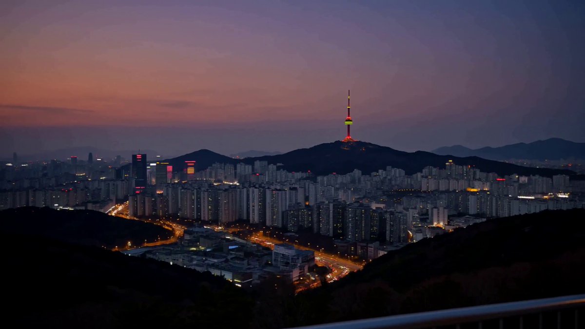
The scenes inside the letters should depict [CITY]-specific landmarks, local streets, transit, architecture, nature, café life, and daily atmosphere.

In the final section, gradually connect the fragments and transition into a full-city reveal.
End with the city as the main illustrated background and the giant word “[CITY]” overlaid in bold light-colored typography, creating a visual reversal from the earlier composition.

Style: mid-century modern travel poster, Swiss graphic design, flat vector-inspired illustration, muted pastel colors, clean geometry, premium editorial destination branding.

Audio: emotional instrumental music with subtle city ambience only. No narration, no singing, no foreground dialogue. Gentle ambient sounds may include distant trains, traffic, birds, wind, café sounds, footsteps, and faint distant laughter.

Avoid photorealism, chaotic motion, messy typography, abrupt cuts, and generic tourism montage.