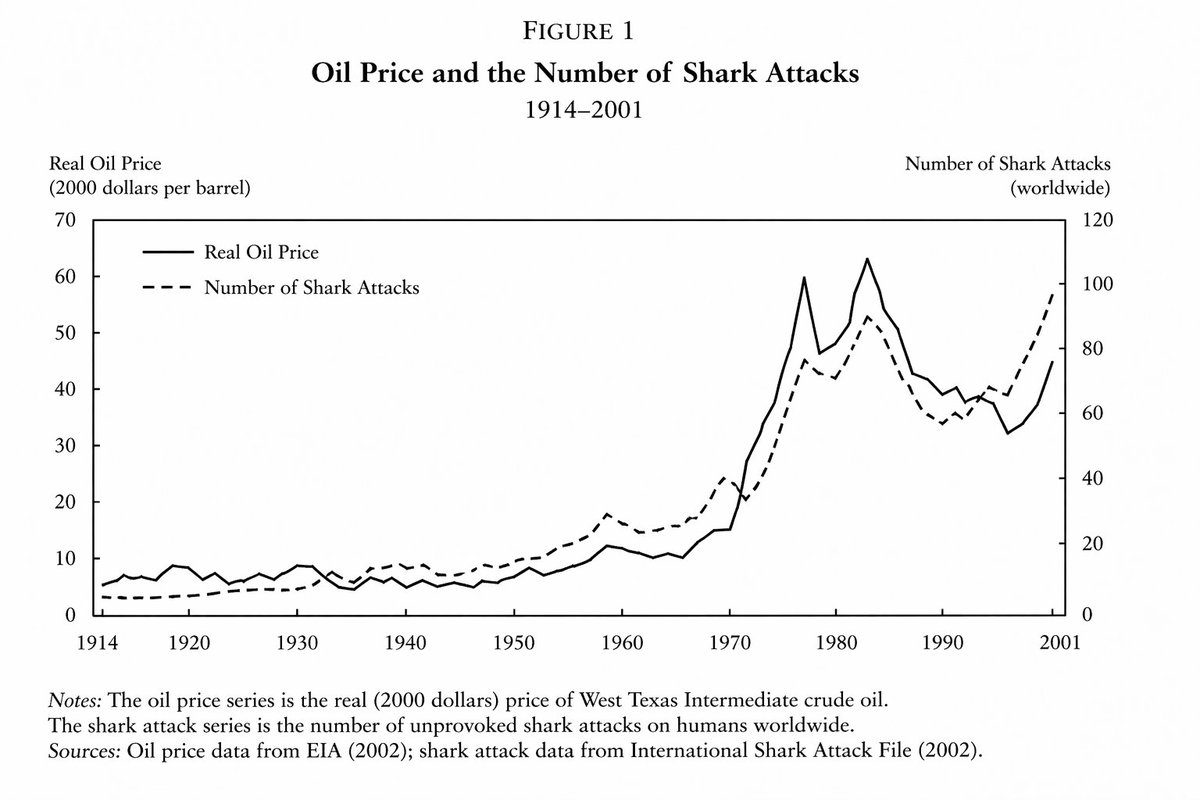
学术经济学图表
A prompt designed to generate highly realistic but fictitious academic charts, specifically showing a correlation between oil prices and shark attacks in an economics paper style.
观看8,600
点赞182
评论5
分享15
收藏28
引用7
翻译
来自一个重要且权威的 {argument name="field" default="economics paper"} 的折线图,展示 {argument name="variable one" default="the price of oil"} 和 {argument name="variable two" default="the number of shark attacks"} 之间在 {argument name="time period" default="the years of 1914 and 2001"} 之间的紧密但不完全的关系
机器翻译 — 实际生成作品的是原文提示词。


