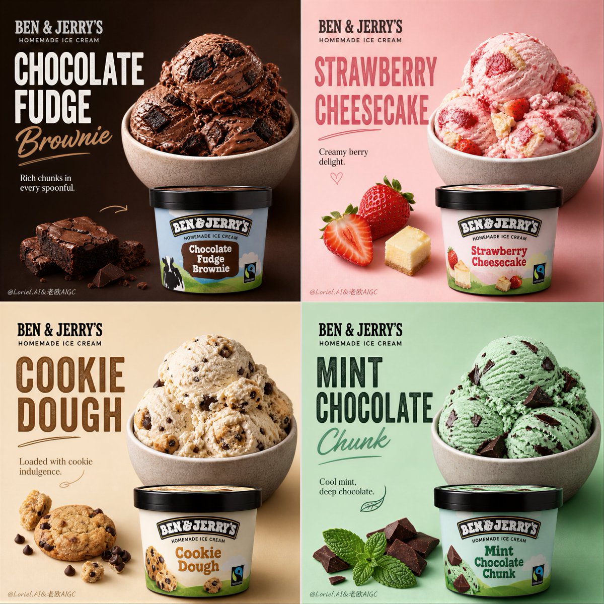
Premium Ice Cream Product Grid Poster
A structural prompt for creating a 2x2 grid layout ice cream promotional poster with consistent framing and realistic textures.
Prompt
創建一個超高端的4面板宣傳海報,為Ben & Jerry's自製冰淇淋,融合極致的冰淇淋球逼真度與更強的風味情感區分,同時保持嚴格的高端展示順序。完全保持大膽產品網格活動的確切結構邏輯和視覺節奏:嚴格的2x2佈局,每個面板呈現一個真實的Ben & Jerry's冰淇淋口味,作為精緻的主角產品廣告,同時屬於一個統一的奢華宣傳系列。最終作品必須感覺像一個世界級的冰淇淋活動:超逼真、色彩豐富、整潔、開胃、編輯風格、視覺上引人注目,具有強烈的產品焦點、優雅的英文字體、微妙的手寫強調、精煉的官方品牌和完美控制的構圖。核心結構:使用嚴格的2x2四格佈局,面板比例相等,間距緊密一致。每個面板必須像自己的高端冰淇淋宣傳卡,但四個在一起必須讀取為一個連貫的Ben & Jerry's系列。完整構圖應感覺平衡、大膽、可收藏且立即可讀。產品系統:展示四個真實的Ben & Jerry's冰淇淋口味,每個通過顏色、配料、質地和情感風味身份明確區分,同時仍然屬於一個高端活動家族。建議陣容:1. Chocolate Fudge Brownie 2. Strawberry Cheesecake 3. Cookie Dough 4. Mint Chocolate Chunk 每個面板必須包括:- 一個真實的Ben & Jerry's品脫包裝作為清晰的主角元素 - 一個匹配的冰淇淋服務在碗或盤中容器 - 僅幾個克制的真實成分強調 - 一個強烈的標題區塊 - 一個簡短的支持行 - 微妙的官方品牌存在 碗和盤的一致性:這至關重要:四個面板中所有碗或服務容器必須出現在完全相同的大小、相同的放置邏輯和相同的框架結構中。每個碗必須完全可見,永不被圖像邊緣裁剪,永不切割,永不浮動在不一致的位置。碗必須感覺對齊為一個奢華展示系統,跨越四格佈局。品脫容器也應遵循相對於碗的一致展示節奏,保持視覺秩序和高端展示。每個面板內的構圖:每個面板應將服務碗放在一致的上部或右上錨定區域,將品脫容器放在一致的下部或中下錨定區域,為標題字體保留優雅的負空間。僅添加幾個克制的成分強調,如布朗尼塊、草莓片、餅乾片、薄荷葉或巧克力碎片,取決於口味。保持構圖整潔、高端且高度控制。風味身份:1. Chocolate Fudge Brownie:豐富的巧克力棕色冰淇淋球質地,深色布朗尼塊,深可可豐富性,大膽放縱的黑暗 2. Strawberry Cheesecake:淡粉色冰淇淋,草莓片,微妙的莓果漩渦,奶油甜點甜蜜,柔和浪漫的明亮 3. Cookie Dough:溫暖的奶油米色基底,餅乾麵團塊,巧克力片,舒適的烘焙甜點放縱,懷舊豐富 4. Mint Chocolate Chunk:新鮮的薄荷綠色色調,深巧克力塊,薄荷葉,涼爽奶油新鮮度,乾淨活潑的結束 四種口味必須感覺像四個不同的氛圍世界:黑暗放縱、水果愉悅、溫暖舒適和涼爽新鮮。這種情感對比應在視覺上立即。背景顏色系統:使用四個不同的飽和高端背景顏色,每個更堅定地匹配風味身份:- Chocolate Fudge Brownie:深巧克力棕色或深可可 - Strawberry Cheesecake:腮紅粉色或柔和莓果奶油 - Cookie Dough:溫暖香草米色或金色奶油 - Mint Chocolate Chunk:新鮮薄荷綠或涼爽柔和翡翠 背景必須大膽、整潔且奢華,永不便宜或嘈雜。每個面板應感覺獨特,同時在4格系統中保持和諧。字體和品牌:使用優雅的僅英文字體,因為這是一個國際原創品牌產品。包括:BEN & JERRY'S HOMEMADE ICE CREAM 然後每個口味標題以大高端文字,例如:CHOCOLATE FUDGE BROWNIE STRAWBERRY CHEESECAKE COOKIE DOUGH MINT CHOCOLATE CHUNK 在每個面板添加一個簡短的支持行,如:Rich chunks in every spoonful. Creamy berry delight. Loaded with cookie indulgence. Cool mint, deep chocolate. 字體必須感覺大膽、整潔、現代和高端。添加微妙的官方風格品牌標記放置。不要中文文字。不要粗糙字體。手寫強調邏輯:僅在需要時添加最少的手寫風格強調:一個小下劃線、一個柔和箭頭、一個小花紋筆劃,或一個微妙的圓圈靠近口味標題或成分。這些細節必須感覺俏皮但精緻,永不凌亂。冰淇淋逼真度:將逼真度推到絕對最高水平。冰淇淋球必須感覺奶油、冰冷、密集且豐富質地,具有真實的勺漩渦圖案、邊緣的融化柔軟度、微妙的霜凍和高度可信的夾心。布朗尼塊必須感覺 fudgy 和濕潤。草莓必須感覺新鮮和多汁。餅乾麵團塊必須感覺柔軟和豐富。薄荷葉和巧克力塊必須感覺脆而高端。僅添加克制的冷凝、微小的冷水滴、柔軟的高光和最小的表面融化在適當的地方。一切必須感覺原始和高度可食用。進一步推進冰淇淋球表面逼真度,使每個口味感覺像一個自己的奢華觸覺世界。燈光:使用極其精緻、柔軟、高端的工作室燈光。讓每個冰淇淋球在奶油山脊、光澤夾心、水果表面和品脫包裝邊緣捕捉美麗的高光。陰影必須短、柔軟且受控。燈光應使產品感覺新鮮、冰冷、奢華和收藏級。視覺氛圍:完整的4面板海報必須傳達高端放縱、風味個性、產品自信和精品甜點活動優雅。它應感覺像一個精緻的國際冰淇淋發佈活動或高端社交媒體宣傳系列,具有強烈的視覺一致性和精煉的產品層次結構。四種口味之間的情感層次必須更強和更令人難忘。渲染風格:超高端逼真冰淇淋廣告海報,Ben & Jerry's自製冰淇淋,4面板奢華產品網格,四個真實的口味變體,具有更強的氛圍區分,所有面板相同的碗大小和放置,碗完全可見,高端品脫包裝,優雅的英文字體,飽和的風味匹配背景,最少的手寫強調,柔軟的電影工作室燈光,超細緻的冰淇淋球質地和配料,世界級甜點活動美學,8k,傑作品質 負面提示:裁剪的碗、不一致的碗大小、偏離中心的服務放置、便宜超市廣告、雜亂構圖、卡通冰淇淋、假冰淇淋球質地、塑料水果、不
機器翻譯 — 實際產出作品的是原文 prompt。
原文 Prompt
Create an ultra-premium 4-panel promotional poster for Ben & Jerry's Homemade Ice Cream, merging extreme scoop realism with stronger flavor-emotion differentiation while preserving strict premium display order. Fully preserve the exact structural logic and visual rhythm of a bold product grid campaign: a strict 2x2 layout, each panel presenting one real Ben & Jerry's ice cream flavor as a polished hero product advertisement while remaining part of one unified luxury promotional series. The final artwork must feel like a world-class ice cream campaign: hyper-realistic, colorful, clean, appetizing, editorial, and visually striking, with strong product focus, elegant English typography, subtle handwritten accents, refined official branding, and perfectly controlled composition. Core structure: Use a strict 2x2 four-grid layout with equal panel proportions and tight spacing consistency. Each panel must function like its own premium ice cream promo card, but all four together must read as one coherent Ben & Jerry's series. The full composition should feel balanced, bold, collectible, and immediately readable. Product system: Feature four real Ben & Jerry's ice cream flavors, each clearly differentiated by color, topping, texture, and emotional flavor identity while still belonging to one premium campaign family. Suggested lineup: 1. Chocolate Fudge Brownie 2. Strawberry Cheesecake 3. Cookie Dough 4. Mint Chocolate Chunk Each panel must include: - one real Ben & Jerry's pint pack as a clear hero element - one matching ice cream serving in a bowl or plated vessel - only a few restrained real ingredient accents - one strong title block - one short supporting line - subtle official brand presence Plate and bowl consistency: This is essential: all bowls or serving vessels across the four panels must appear in exactly the same size, same placement logic, and same framing structure. Every bowl must be fully visible, never cropped by the image edge, never cut off, and never floating at inconsistent positions. The bowls must feel aligned as one luxury display system across the four-grid layout. The pint containers should also follow a consistent display rhythm relative to the bowl, preserving visual order and premium presentation. Composition within each panel: Each panel should place the serving bowl in a consistent upper or upper-right anchor area, and the pint container in a consistent lower or lower-middle anchor area, with elegant negative space reserved for title typography. Add only a few restrained ingredient accents such as brownie chunks, strawberry slices, cookie pieces, mint leaves, or chocolate shards depending on flavor. Keep the composition clean, premium, and highly controlled. Flavor identities: 1. Chocolate Fudge Brownie: rich chocolate-brown scoop texture, dark brownie chunks, deep cocoa richness, bold indulgent darkness 2. Strawberry Cheesecake: pale pink ice cream, strawberry slices, subtle berry swirl, creamy dessert sweetness, soft romantic brightness 3. Cookie Dough: warm cream-beige base, cookie dough chunks, chocolate chips, comforting baked-dessert indulgence, nostalgic richness 4. Mint Chocolate Chunk: fresh mint-green tone, dark chocolate chunks, mint leaves, cool creamy freshness, clean lively finish The four flavors must feel like four distinct mood-worlds: dark indulgence, fruity delight, warm comfort, and cool freshness. This emotional contrast should be visually immediate. Background color system: Use four different saturated premium background colors, each matched more decisively to the flavor identity: - Chocolate Fudge Brownie: deep chocolate brown or dark cocoa - Strawberry Cheesecake: blush pink or soft berry cream - Cookie Dough: warm vanilla beige or golden cream - Mint Chocolate Chunk: fresh mint green or cool soft jade The backgrounds must be bold, clean, and luxurious, never cheap or noisy. Each panel should feel distinct while still remaining harmonious in the 4-grid system. Typography and branding: Use elegant English-only typography, because this is an international original brand product. Include: BEN & JERRY'S HOMEMADE ICE CREAM Then each flavor title in large premium text, for example: CHOCOLATE FUDGE BROWNIE STRAWBERRY CHEESECAKE COOKIE DOUGH MINT CHOCOLATE CHUNK Add one short supporting line in each panel such as: Rich chunks in every spoonful. Creamy berry delight. Loaded with cookie indulgence. Cool mint, deep chocolate. Typography must feel bold, clean, modern, and premium. Add subtle official-style brand mark placement. No Chinese text. No crude fonts. Handwritten accent logic: Add only minimal handwritten-style accents if needed: a tiny underline, a soft arrow, a small flourish stroke, or a subtle circle near the flavor title or ingredient. These details must feel playful but refined, never messy. Ice cream realism: Push the realism to the absolute highest level. The scoops must feel creamy, cold, dense, and richly textured, with real spooned swirl patterns, melt softness at the edges, subtle frost, and highly believable inclusions. Brownie pieces must feel fudgy and moist. Strawberries must feel fresh and juicy. Cookie dough chunks must feel soft and rich. Mint leaves and chocolate chunks must feel crisp and premium. Add only restrained condensation, tiny cold droplets, soft highlights, and minimal surface melt where appropriate. Everything must feel pristine and highly edible. Push the scoop surface realism further so each flavor feels like a luxurious tactile world of its own. Lighting: Use extremely delicate, soft, high-end studio lighting. Let each scoop catch beautiful highlights on creamy ridges, glossy inclusions, fruit surfaces, and pint packaging edges. Shadows must be short, soft, and controlled. The lighting should make the products feel fresh, cold, luxurious, and collector-grade. Visual mood: The full 4-panel poster must communicate premium indulgence, flavor individuality, product confidence, and boutique dessert-campaign elegance. It should feel like a polished international ice cream launch campaign or premium social-media promotional series with strong visual consistency and refined product hierarchy. The emotional hierarchy between the four flavors must be stronger and more memorable. Rendering style: ultra-premium photorealistic ice cream advertising poster, Ben & Jerry's Homemade Ice Cream, 4-panel luxury product grid, four real flavor variants with stronger mood differentiation, identical bowl size and placement across all panels, full bowls completely visible, premium pint packaging, elegant English typography, saturated flavor-matched backgrounds, minimal handwritten accents, soft cinematic studio lighting, hyper-detailed scoop texture and toppings, world-class dessert campaign aesthetics, 8k, masterpiece quality Negative prompt: cropped bowls, inconsistent bowl sizes, off-center serving placement, cheap supermarket ad, cluttered composition, cartoon ice cream, fake scoop texture, plastic fruit, unrea