Typography Parkour Commercial
回視聴9,101
いいね133
コメント6
シェア12
ブックマーク108
引用5
Commercial film.

Maintain the initial background color throughout the sequence.

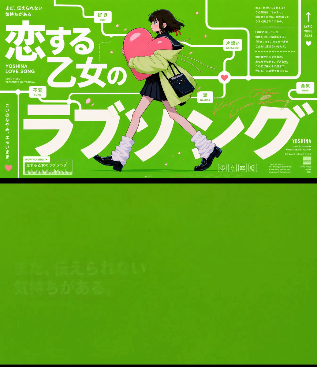
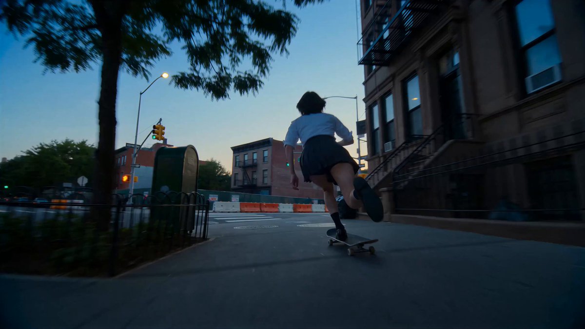
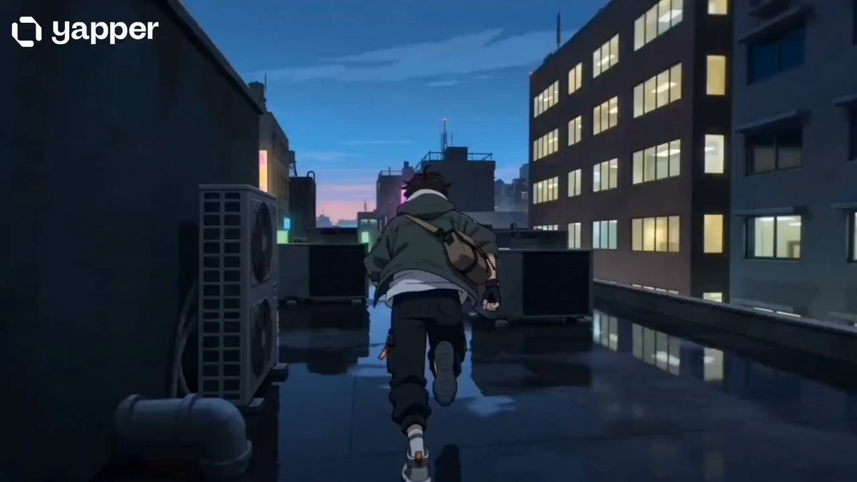
The camera smoothly tracks the character with a continuous horizontal side-scrolling movement, following them as they travel across the frame.

Text and connecting lines progressively appear across the screen, forming a continuous route-like structure. The connected lines should resemble railway tracks or a visual transit path, linking one text element to the next.

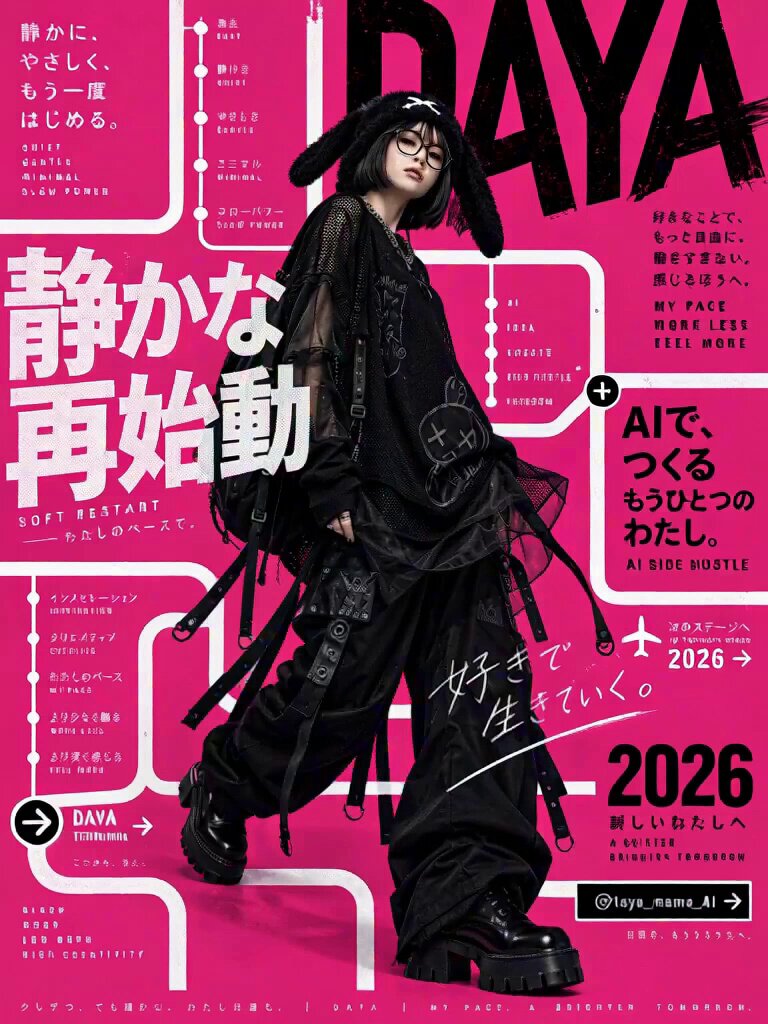
The text from the reference image must appear sequentially, in the original order, and be faithfully reproduced without garbled characters, corrupted typography, misspellings, or altered wording.

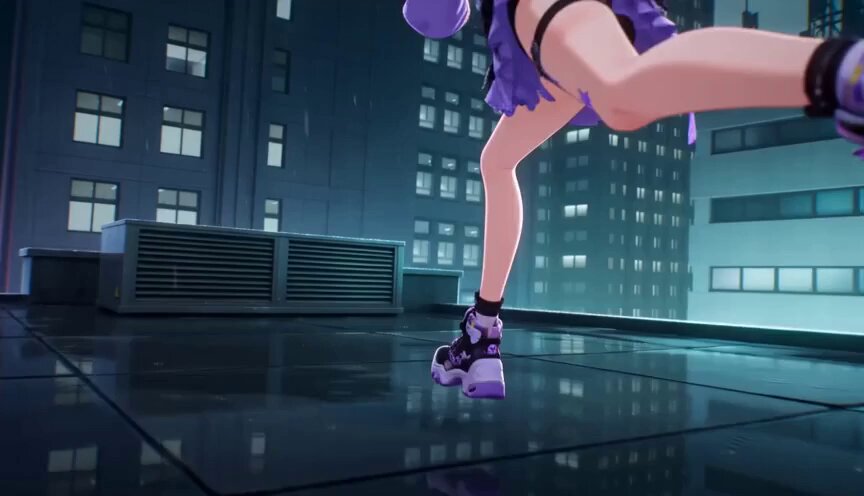
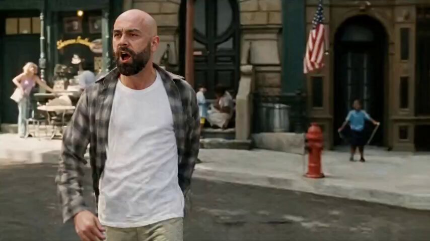
The character recognizes the text and graphic elements as physical structures existing in the same space. As they move forward, they use them like architectural obstacles and parkour terrain. The character runs, jumps, vaults, climbs, lands, slides, ducks, steps over, and weaves through the typographic structures. Some letters act like platforms, some words become barriers to leap over, some circular shapes become tunnels to pass through, and some lines become rails, ledges, or pathways to run along.

The movement should feel agile, stylish, and athletic. The character may jump from one text block to another, land on top of a word, spring off a graphic element, slide under a low typographic bar, sidestep a moving object, or briefly balance on a connecting line before continuing forward. The action should always feel natural and readable, with the character responding to the surrounding text and graphic elements as if navigating a real environment.

The text and graphic elements must not feel like flat background decorations. They should feel physically present in the same three-dimensional space as the character, with convincing depth, scale, and spatial interaction.

Do not repeat or duplicate any text.

Keep the overall pacing fast, rhythmic, and fluid. Preserve the unin