Kawaii Tomato Cat Perfume Flyer
A structured prompt for generating a cute Japanese-style perfume advertisement flyer featuring a tomato-cat character and detailed product information cards.
프롬프트
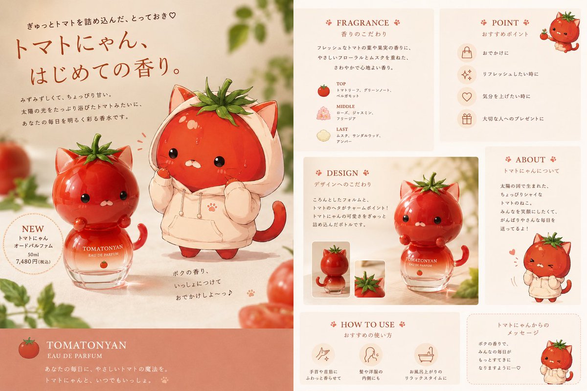
목표: 귀여운 코스메틱 브랜드의 부드러운 상업용 포스터처럼, 오리지널 토마토 고양이 향수를 위한 귀여운 일본풍 향수 광고 전단지를 제작하세요. {argument name="product name" default="TOMATONYAN"}을 향수 이름으로 사용하고, 전체적인 분위기는 따뜻하고 달콤하며 약간 고급스러운 느낌을 유지하세요.

캔버스: 가로가 긴 16:9 비율의 전단지로, 왼쪽의 큰 메인 광고 패널과 오른쪽의 좁은 정보 패널로 나뉩니다. 배경은 따뜻한 크림색에 복숭아 톤이 가미되었으며, 부드러운 햇살, 얕은 피사계 심도, 가장자리에 흐릿하게 처리된 토마토 덩굴과 녹색 식물, 그리고 깔끔한 잡지 레이아웃으로 마무리하세요.

왼쪽 메인 패널: 왼쪽 중앙 영역에 정확히 2마리의 메인 토마토 고양이 캐릭터를 배치하세요. 둥근 유리 향수병 위에 앉아 있는 광택 나는 빨간 토마토 고양이 1마리와, 고양이 귀가 달린 연한 크림색 후드티를 입은 더 큰 토마토 고양이 1마리입니다. 두 캐릭터 모두 머리에 토마토 줄기 잎사귀가 있고, 작고 반짝이는 검은 눈, 작은 흰색 입, 발그레한 볼, 귀엽고 둥근 몸을 가지고 있습니다. 향수병은 연한 복숭아색 액체가 담긴 투명 유리병이며, 토마토 모양의 빨간 뚜껑/캐릭터 머리가 달려 있고, 흰색 브랜드 텍스트로 “TOMATONYAN EAU DE PARFUM”과 작은 토마토 아이콘이 새겨져 있습니다. 메인 영역 왼쪽 하단에 일본어 제품/가격 텍스트가 포함된 점선 원형 “NEW” 배지를 추가하세요. 왼쪽 상단 근처에 큰 손글씨 스타일의 일본어 헤드라인을 추가하세요: {argument name="headline text" default="トマトにゃん、はじめての香り。"}. 그 위아래로 귀여운 하트를 포함한 작은 일본어 문구를 추가하세요. 메인 영역 하단 중앙 근처에는 작은 발바닥 모양의 강조 표시와 함께 짧은 손글씨 일본어 메시지를 추가하세요.

왼쪽 하단 브랜드 스트립: 왼쪽 패널 하단에 전체 너비의 차분한 산호색 직사각형을 추가하세요. 작은 토마토 아이콘, 큰 세리프체 브랜드 텍스트 “TOMATONYAN”, 더 작은 텍스트 “EAU DE PARFUM”, 그리고 흰색으로 된 두 줄의 짧은 일본어 태그라인을 포함하세요.

오른쪽 정보 패널 레이아웃: 연한 복숭아색 배경 위에 깔끔한 간격으로 구분된 6개의 둥근 직사각형 크림색 카드를 배치하세요. 작은 발바닥/꽃 장식이 있는 섬세한 적갈색 세리프체 영어 제목과 더 작은 일본어 부제목을 사용하세요. 6개의 카드는 다음과 같습니다: “FRAGRANCE”(향 노트) 카드, “POINT”(추천 포인트) 카드, “DESIGN”(디자인 설명) 카드, “ABOUT”(캐릭터 스토리) 카드, “HOW TO USE”(사용법) 카드, 그리고 토마토 고양이의 메시지 카드.

카드 세부 정보 및 개수: “FRAGRANCE” 카드에는 TOP, MIDDLE, LAST로 라벨이 붙은 정확히 3개의 향 노트 행이 포함되어야 하며, 각각 작은 성분 아이콘(TOP은 토마토, MIDDLE은 꽃, LAST는 연한 감귤류/나무 느낌의 아이콘)이 있어야 합니다. “POINT” 카드에는 원형 라인 아이콘(핸드백, 반짝임, 하트, 선물)이 포함된 정확히 4개의 추천 행이 있어야 합니다. “DESIGN” 카드에는 토마토 고양이 향수병의 큰 제품 사진 스타일 일러스트와 그 아래/근처에 정확히 2개의 작은 썸네일 이미지(병 썸네일 1개, 토마토 줄기 클로즈업 썸네일 1개)가 포함되어야 합니다. “ABOUT” 카드에는 일본어 설명 텍스트와 하단에 크림색 후드티를 입은 작은 전신 토마토 고양이 1마리가 포함되어야 합니다. “HOW TO USE” 카드에는 일본어 캡션이 달린 정확히 3개의 사용법 아이콘(손목/목 분사, 머리카락/옷 향기, 목욕 후 휴식)이 포함되어야 합니다. 메시지 카드에는 일본어 메시지 텍스트와 오른쪽에 작은 후드티 입은 토마토 고양이 1마리가 포함되어야 합니다.

시각적 스타일: 수채화 느낌의 귀여운 캐릭터 일러스트와 세련된 코스메틱 제품 사진을 결합하세요. 빨간 토마토 표면과 유리병에는 광택 하이라이트를, 테이블 위에는 부드러운 그림자를, 따뜻한 베이지색 종이 질감, 차분한 산호색 포인트, 우아한 갈색 타이포그래피를 사용하세요. 캐릭터는 사랑스럽고 둥글게 표현되어야 하며, 토마토 피부에는 미세한 물방울/하이라이트가 있어야 합니다. 한정판 향수를 광고하는 것처럼 전단지를 깔끔하고 균형 잡힌 상업적인 느낌으로 유지하세요.

제약 사항: 영어 섹션 제목은 사용할 수 있지만, 본문 대부분은 깔끔한 일본어 광고 텍스트로 나타나야 합니다. 실제 로고, 바코드, 워터마크 또는 불필요한 문자는 피하세요. 위에 나열된 정확한 항목 개수를 유지하세요. 전체적인 색상 팔레트는 크림색, 복숭아색, 토마토 레드, 따뜻한 갈색, 잎사귀 녹색이어야 합니다.
기계 번역 — 실제 결과물을 만든 것은 원문 프롬프트입니다.
원문 프롬프트
Goal: Create a cute Japanese perfume advertising flyer for an original tomato-cat fragrance, like a soft commercial poster for a kawaii cosmetic brand. Use {argument name="product name" default="TOMATONYAN"} as the perfume name and keep the overall feeling warm, sweet, and slightly premium.

Canvas: Wide horizontal flyer, 16:9 aspect ratio, divided into a large left hero advertisement panel and a narrower right information panel. Background is warm cream with peach tones, soft sunlight, shallow depth of field, blurred tomato vines and greenery around the edges, and a clean magazine-layout finish.

Main left hero panel: Feature exactly 2 main tomato-cat characters in the center-left area: 1 glossy red tomato cat sitting on a round glass perfume bottle, and 1 larger tomato cat wearing a pale cream hoodie with cat ears. Both characters have tomato stems as leafy hair, tiny black glossy eyes, small white mouths, blush cheeks, and cute rounded bodies. The perfume bottle is transparent glass with pale peach liquid, a tomato-shaped red cap/character head, and white branding text reading “TOMATONYAN EAU DE PARFUM” plus a tiny tomato icon. Add a dotted circular “NEW” badge on the lower left of the hero area with Japanese product/price text. Add a large handwritten-style Japanese headline near the upper left: {argument name="headline text" default="トマトにゃん、はじめての香り。"}. Add smaller Japanese copy above and below it, including a cute heart. Near the bottom center of the hero area, add a short handwritten Japanese message beside tiny paw-print accents.

Bottom left brand strip: Add a full-width muted coral rectangle at the bottom of the left panel. Include a small tomato icon, the large serif brand text “TOMATONYAN”, smaller text “EAU DE PARFUM”, and two short Japanese tagline lines in white.

Right information panel layout: Arrange exactly 6 rounded rectangular cream cards on a pale peach background, separated by clean gutters. Use delicate red-brown serif English headings with tiny paw/flower ornaments and smaller Japanese subtitles. The 6 cards are: 1 “FRAGRANCE” scent notes card, 1 “POINT” recommendation card, 1 “DESIGN” design explanation card, 1 “ABOUT” character story card, 1 “HOW TO USE” usage card, and 1 message card from the tomato cat.

Card details and counts: The “FRAGRANCE” card contains exactly 3 scent note rows labeled TOP, MIDDLE, and LAST, each with a small ingredient icon: tomato for TOP, flowers for MIDDLE, and a pale citrus/wood-like icon for LAST. The “POINT” card contains exactly 4 recommendation rows with circular line icons: handbag, sparkle, heart, and gift. The “DESIGN” card contains a large product photo-style illustration of the tomato-cat perfume bottle plus exactly 2 small thumbnail images underneath/near it: one bottle thumbnail and one tomato-stem close-up thumbnail. The “ABOUT” card contains Japanese explanatory text and 1 small full-body tomato-cat in a cream hoodie at the bottom. The “HOW TO USE” card contains exactly 3 usage icons with Japanese captions: wrist/neck spray, hair/clothing scent, and after-bath relaxation. The message card contains Japanese message text and 1 small tomato-cat in a hoodie on the right.

Visual style: Combine watercolor-like kawaii character illustration with polished cosmetic product photography. Use glossy highlights on the red tomato surfaces and glass bottle, soft shadows on the table, warm beige paper texture, muted coral accents, and elegant brown typography. The characters should look adorable and rounded, with subtle droplets/highlights on the tomato skin. Keep the flyer clean, balanced, and commercial, as if advertising a limited-edition fragrance.

Constraints: English section headings may be used, but most body copy should appear as neat Japanese advertising text. Avoid real-world logos, barcodes, watermarks, or extra characters. Keep the exact visible item counts listed above. The overall palette should be cream, peach, tomato red, warm brown, and leafy green.