13enBus iPhone Launch Banner
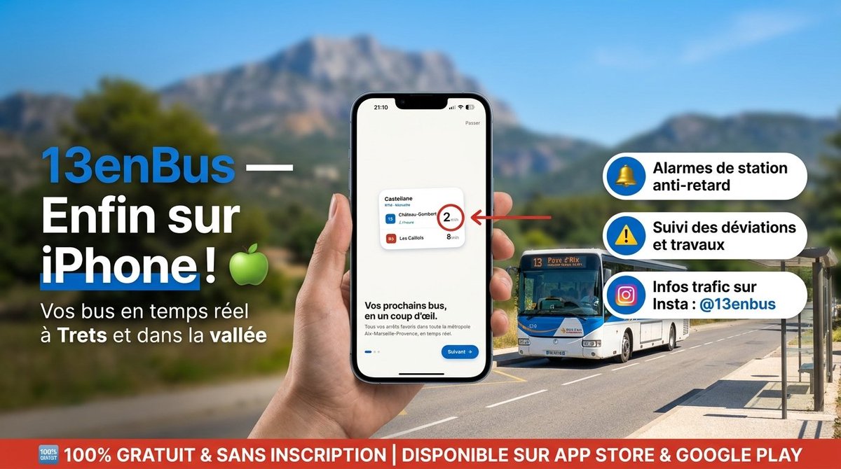
A French transit app launch advertisement showing an iPhone app mockup, bus route callouts, and a free-download banner for social media promotion.
프롬프트
목표: 대중교통 앱 {argument name="app name" default="13enBus"}의 iPhone 출시를 알리는 고해상도 프랑스어 홍보용 소셜 미디어 배너를 세련된 광고 스타일로 제작합니다.

캔버스: 가로 16:9 비율의 와이드 배너, 약 1200×675 px. 배경은 심도가 얕은 밝은 지중해 야외 환경으로 설정합니다: 푸른 하늘, 흐릿한 녹색 계곡, 멀리 보이는 바위산, 그리고 오른쪽에 버스 정류장이 있는 화창한 도로.

레이아웃: 왼쪽에는 대비가 강한 프랑스어 헤드라인을 크게 배치합니다: 밝은 파란색으로 “13enBus —”를 쓰고, 그 뒤에 큰 흰색 텍스트로 “Enfin sur iPhone !”을 적은 뒤 옆에 초록색 사과 이모지를 추가합니다. 그 아래에는 흰색으로 “Vos bus en temps réel à Trets et dans la vallée”라는 부제목을 넣습니다. 중앙 전경에는 현대적인 검은색 iPhone을 수직으로 들고 있는 사실적인 손을 배치합니다. 휴대폰 화면에는 작은 교통 카드, “Vos prochains bus, en un coup d'œil.”라는 제목, 파란색 “Suivant” 버튼, 그리고 세밀한 앱 인터페이스가 포함된 깔끔한 온보딩 화면을 표시합니다. 오른쪽에서 휴대폰의 작은 교통 카드를 가리키는 빨간색 화살표를 배치하여 원으로 표시된 대기 시간을 강조합니다.

주요 피사체 세부 정보: 휴대폰 화면에는 3개의 버스 노선이 보이는 1개의 작은 교통 카드가 포함되어야 합니다: 15번 노선 “Château-Gombert” (빨간색 원으로 “2 min” 강조), 15번 노선 “Auriol” (“7 min”), 85번 노선 “Les Caillols” (“8 min”). 휴대폰 뒤 오른쪽에는 도로를 달리는 사실적인 흰색-파란색 시내버스 1대를 배치합니다. 버스는 정면이 살짝 관찰자를 향하게 하고, 행선지 표지판에 13번 노선 번호가 보여야 합니다.

기능 강조 문구: 오른쪽에는 왼쪽에 파란색 원형 아이콘이 있고 굵은 검은색 프랑스어 텍스트가 적힌 둥근 알약 모양의 기능 상자 3개를 쌓아서 배치합니다. 3개의 상자 내용: 1) 노란색 종 아이콘, “Alarmes de station anti-retard”; 2) 노란색 경고 삼각형 아이콘, “Suivi des déviations et travaux”; 3) 인스타그램 스타일의 그라데이션 카메라 아이콘, “Infos trafic sur Insta : {argument name="instagram handle" default="@13enbus"}”.

하단 배너: 하단을 가로지르는 전체 너비의 빨간색 띠를 추가하고, 맨 왼쪽에 작은 “100% GRATUIT” 배지를, 중앙에는 큰 흰색 대문자 텍스트로 “100% GRATUIT & SANS INSCRIPTION | DISPONIBLE SUR APP STORE & GOOGLE PLAY”를 넣습니다.

시각적 스타일: 사실적인 HD 광고 합성, 선명한 타이포그래피, 채도가 높은 색상, 강렬한 햇살, 전문적인 앱 출시 캠페인 디자인. 파란색, 흰색, 빨간색, 초록색 액센트를 활용한 깔끔한 프랑스 대중교통 앱 브랜딩을 유지합니다. 배경은 부드럽게 흐릿하게 처리하고 휴대폰과 텍스트는 선명하게 유지합니다.

제한 사항: 설명된 3개의 기능 강조 문구, 1개의 휴대폰, 1개의 손, 1대의 버스, 1개의 하단 빨간색 배너, 1개의 초록색 사과 이모지만을 정확히 사용합니다. 추가 로고, 워터마크, 관련 없는 추가 텍스트는 포함하지 마십시오.
기계 번역 — 실제 결과물을 만든 것은 원문 프롬프트입니다.
원문 프롬프트
Goal: Create a high-resolution French promotional social media banner for the public transport app {argument name="app name" default="13enBus"}, announcing its iPhone availability in a polished advertising style.

Canvas: Wide horizontal 16:9 banner, approximately 1200×675 px. Use a bright Mediterranean outdoor setting with a shallow-depth-of-field background: blue sky, blurred green valley, distant rocky mountain, and a sunny road with a bus stop shelter on the right.

Layout: On the left, place a large bold headline in French with strong contrast: “13enBus —” in bright blue followed by “Enfin sur iPhone !” in large white text, with a green apple emoji beside it. Under it, add the subtitle “Vos bus en temps réel à Trets et dans la vallée” in white. In the center foreground, show a realistic hand holding a modern black iPhone vertically. On the phone screen, display a clean app onboarding screen with a small transit card, the heading “Vos prochains bus, en un coup d'œil.”, a blue “Suivant” button, and tiny app interface details. A red arrow points from the right toward the phone’s small transit card, highlighting a circled waiting time.

Main subject details: The phone screen should include exactly 1 small transit card with exactly 3 visible bus rows: line 15 “Château-Gombert” with “2 min” emphasized in a red circle, line 15 “Auriol” with “7 min”, and line 85 “Les Caillols” with “8 min”. Behind the phone on the right, place exactly 1 realistic white-and-blue city bus driving on the road, front facing slightly toward the viewer, with route number 13 visible on its sign.

Feature callouts: On the right side, stack exactly 3 rounded white pill-shaped feature boxes with blue circular icons on the left and bold black French text. The 3 boxes are: 1) yellow bell icon, “Alarmes de station anti-retard”; 2) yellow warning triangle icon, “Suivi des déviations et travaux”; 3) Instagram-style gradient camera icon, “Infos trafic sur Insta : {argument name="instagram handle" default="@13enbus"}”.

Bottom banner: Add a full-width red strip along the bottom with a small “100% GRATUIT” badge at the far left and large white uppercase text: “100% GRATUIT & SANS INSCRIPTION | DISPONIBLE SUR APP STORE & GOOGLE PLAY”.

Visual style: Realistic HD advertising composite, crisp typography, saturated colors, strong sunlight, professional app launch campaign design. Use clean French transit-app branding with blue, white, red, and green accents. Keep the phone and text sharp while the background remains softly blurred.

Constraints: Use exactly the described 3 feature callouts, exactly 1 phone, exactly 1 hand, exactly 1 bus, exactly 1 bottom red banner, and exactly 1 green apple emoji. No extra logos, no watermark, no additional unrelated text.