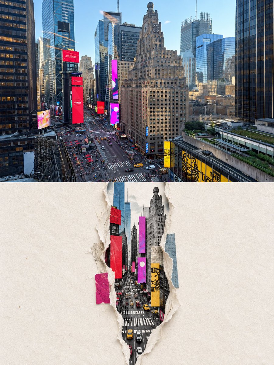
Torn Paper Collage Poster
visualizações4,095
curtidas34
comentários3
compartilhamentos3
salvos24
citações0
Create abhigh-end design poster from this photo.

Use a 3:4 vertical composition overall, divided into two equal sections with a strict 1:1 height ratio, each occupying 50% of the image.

Top half: Preserve the original photo, maintaining the subject’s identity, structure, posture, realistic texture, natural lighting and shadows, and original color atmosphere. Only apply subtle, refined color grading to give it the quality of an art magazine or exhibition image. To fit the format, the surrounding environment may be naturally extended if needed, but the subject must not be stretched, distorted, or altered.

Bottom half: Extract only the most recognizable subject, contour, structure, posture, and narrative relationship from the photo, and reconstruct them into a centrally composed torn-paper cutout digital collage. Do not fully copy the original photo, do not redraw every object, and do not preserve most of the background. Remove irrelevant details proactively, keeping only the structures, directional flow, and visual memory points that best represent the original subject.

The bottom half must use a centered composition: place a vertical, irregular torn crack in the center of a large light-colored fiber paper background. The crack should have realistic rough edges and thickness, and it must serve as the core visual focus of the composition.

The content inside the crack should not be a realistic scene. Instead, reconstruct the subject using simplified geometric color blocks, reduced contours, and layered collage elements, creating a more restrained, abstract reorganization that is still instantly recognizable. If necessary, key parts may slightly break through the edge of the tear and extend outward to create tension and a sense of emerging from the surface, while still keeping the overall result restrained.

Even if the original image has a weak composition, a messy background, or a small subject, you should actively make new artistic judgments—rescuing it into a strong finished work through reduction, reorganization, cropping, scale adjustments, and whitespace. Truly re-direct the image rather than simply copying the original.

The composition must preserve a very large amount of intentional negative space. This negative space should not feel like empty background, but should work together with the central tear, the internal color-block subject, and a few supporting elements to create breathing room, spatial rhythm, and pause. Prefer less rather than more. Build a refined visual order through the central tear and a small number of high-value graphic elements.

Emphasize a paper-craft material quality: preserve the paper texture, fibers, rough edges, curling, layered thickness, and soft shadows, so that both the tear and the paper surface feel real and tactile. The overall result should be a high-end digital collage, not a photograph of a handmade craft piece. Avoid smooth vector graphics, cheap-looking 3D, photographic filters, and overly realistic rendering.

For the color palette, extract 2–4 of the most elegant and vivid colors from the top photo and reinterpret them. The overall palette should remain light, airy, restrained, and refined. Use large areas of warm white, off-white, and pale gray-white as the main paper colors, and reconstruct the subject inside the tear using a small number of brightened, purified, and de-muddied composite color blocks. Avoid dirty grays, aged-looking tones, visual clutter, and cheap high saturation.


