Three Cafe Editorial Posters
回視聴6,460
いいね146
コメント28
シェア17
ブックマーク82
引用0
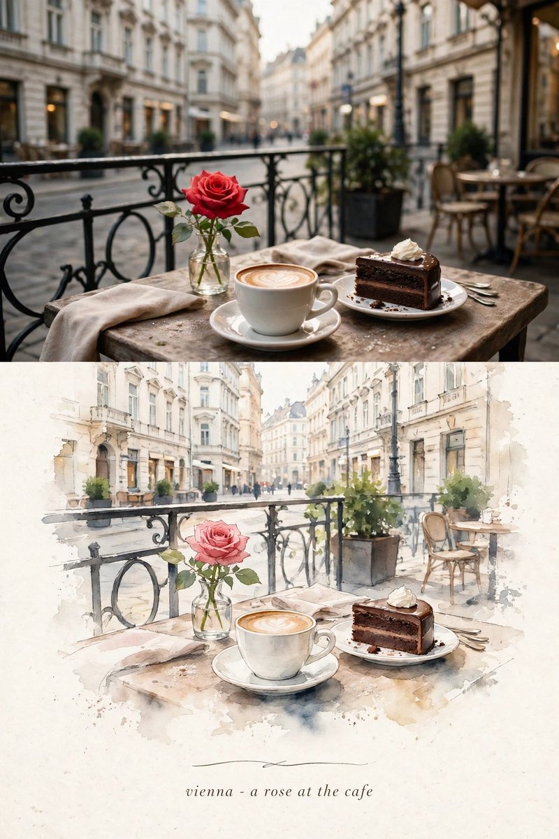
Use all three uploaded images as the EXACT visual references. Recreate the three original scenes faithfully as a single cohesive premium editorial art-book poster collection, preserving the visual identity, composition, subjects, objects, architecture, café elements, camera perspectives, framing, lighting, colors, proportions, and atmosphere of each reference image.

Do NOT redesign, replace, add, remove, merge, or reinterpret any major element from the three original scenes. Each scene must remain clearly recognizable and faithful to its respective reference image.

STRICT 3:4 vertical format.

Create a sophisticated three-part editorial poster composition, with each of the three original scenes presented as a distinct visual section while maintaining one consistent premium art-book aesthetic.

SCENE 1 — VIENNA:
Faithfully preserve the original Vienna café scene, including the red rose in the clear glass vase, white coffee cup and saucer with latte art, slice of chocolate cake with cream, silver cutlery, folded napkins, rustic wooden café table, decorative black metal railing, outdoor café seating, potted plants, softly blurred historic European buildings, street, natural depth of field, warm ambient lighting, and exact spatial relationships.

SCENE 2 — ISTANBUL:
Faithfully preserve the original Istanbul café scene, including the red rose in the clear glass vase, traditional Turkish tea in the tulip-shaped glass, silver spoon and saucer, rustic wooden café table, folded napkin, outdoor café seating, potted plants, historic buildings on both sides of the narrow cobblestone street, the centered Galata Tower in the distance, pedestrians, storefronts, natural sunlight, and exact spatial relationships.

SCENE 3 — PRAGUE:
Faithfully preserve the original Prague café scene, including the red rose in the clear glass vase, white coffee cup and saucer, spoon, folded napkin, rustic wooden café table, café chairs, potted red flowers, historic European buildings, cobblestone pavement, softly blurred distant architecture and street, warm natural lighting, and exact spatial relationships.

PHOTOGRAPHIC TREATMENT:
Keep the original photographic portions almost completely unchanged. Preserve all original objects, architecture, food and drinks, flowers, tables, streets, perspective, depth of field, lighting, and composition. Apply only subtle cinematic editorial color grading, natural contrast, refined tonal balance, realistic textures, and premium film texture.

ILLUSTRATION TREATMENT:
For each of the three scenes, create a small centered minimalist handmade-paper illustration based ONLY on the recognizable elements belonging to that specific original scene.

For Vienna: the red rose, coffee cup, chocolate cake, café table, railing, chairs, plants, and historic European street.

For Istanbul: the red rose, Turkish tea glass, café table, Galata Tower, historic Istanbul buildings, cobblestone street, storefronts, and café details.

For Prague: the red rose, coffee cup, café table, chairs, potted flowers, cobblestone street, and historic Prague architecture.

Use delicate imperfect ink lines, simple refined flat shapes, organic handmade edges, subtle paper grain, and restrained palettes extracted directly from each original photograph.

Keep the illustrations elegant and understated, with generous warm ivory/off-white negative space around them.

Maintain a consistent premium handmade editorial art-book language across all three scenes while keeping each location visually distinct and faithful to its reference.

Optional typography:
Use very small refined editorial serif or delicate handwritten-style typography beneath each corresponding scene:

“vienna - a rose at the cafe”

“istanbul - a rose at the cafe”

“prague - a rose at the cafe”

Keep all typography minimal, elegant, subtle, and museum-quality.

Overall aesthetic:
independent art-book cover, premium editorial photography, quiet storytelling, poetic, sophisticated, timeless, handcrafted, minimal, European travel journal, refined museum-quality presentation.

Color direction:
warm ivory paper, muted architectural neutrals, natural greens, restrained reds from the roses, warm coffee and tea tones, subtle cinematic shadows. Avoid excessive saturation.

Composition:
Keep the three locations clearly separated and recognizable. Do not blend the architecture, objects, food, drinks, landmarks, or visual identities between the scenes. Each reference should retain its own original visual story while the complete poster feels like one cohesive luxury art-book collection.

Avoid:
cartoon style, anime, watercolor-heavy appearance, colored-pencil effect, 3D rendering, glossy graphics, excessive decoration, busy layout, oversaturated colors, artificial architecture, distorted landmarks, distorted food or drinks, extra roses, extra cups, extra tables, extra people, extra animals, altered identities, incorrect perspective, merged locations, or commercial advertising aesthetics.

Most important requirement:
Preserve the original visual identity and composition of ALL THREE uploaded images with maximum fidelity. Do not change the recognizable scenes, objects, architecture, roses, drinks, café tables, streets, landmarks, perspectives, or spatial relationships. The final result should feel like a premium handcrafted editorial art-book interpretation of the SAME three original photographs, not a newly invented scene.


