Japanese Kids English LP Hero
Generates a pastel Japanese landing page hero for an at-home children’s English lesson aimed at busy working mothers.
프롬프트
목표: 바쁜 워킹맘을 위한 가정용 영어 프로그램의 세로형 일본어 랜딩 페이지 첫 화면(FV) 히어로 이미지를 제작합니다. 우측에는 따뜻한 분위기의 모자 학습 사진을, 좌측에는 눈에 띄는 세일즈 카피를 배치하세요.

캔버스: 세로형 스마트폰 LP/FV 디자인, 675×1200 px 또는 9:16 비율, 크림 화이트 배경, 부드러운 파스텔 팔레트, 여유로운 간격, 친근하고 가족적인 분위기.

시각적 스타일: 깔끔한 일본 웹 광고 디자인, 둥근 형태, 손으로 그린 듯한 장식 요소, 파스텔 핑크, 브라운, 옐로우, 민트 그린, 스카이 블루 색상 사용. 밝은 라이프스타일 사진과 그래픽 LP 레이아웃을 조화롭게 구성하세요. 타이포그래피는 크고 둥글며 가독성이 높아야 하며, 핵심 단어는 선명한 핑크색으로 강조하세요.

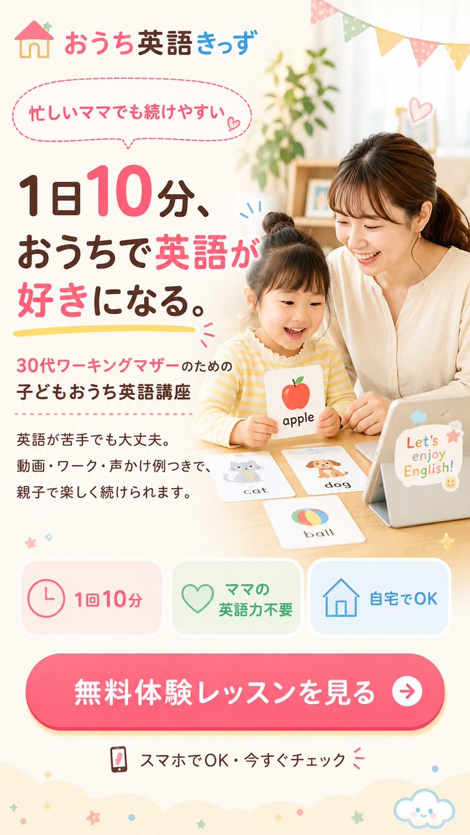
메인 이미지 영역: 우측 절반에는 일본인 엄마와 어린아이가 나무 테이블에 앉아 집에서 영어 플래시카드로 공부하는 모습을 보여주세요. 엄마는 심플한 크림색 블라우스를 입고 아이 옆에 앉아 있으며, 아이는 노란색 줄무늬 상의를 입고 “apple”이라고 적힌 사과 그림 카드를 들고 있습니다. 테이블 맨 오른쪽에는 귀여운 스티커와 “Let’s enjoy English!”라는 문구가 적힌 태블릿을 놓으세요. 테이블 위에는 1) 아이가 들고 있는 사과 카드, 2) 고양이 카드, 3) 강아지 카드, 4) 공 카드 등 총 4장의 영어 플래시카드를 배치하세요. 두 사람의 얼굴은 부드러운 직사각형 피부톤 블러로 가리되, 머리카락, 옷, 손, 활동 모습은 보이게 하세요. 배경에는 식물, 선반, 부드러운 햇살이 비치는 커튼, 우측 상단에 파스텔톤 삼각형 가랜드 장식을 포함하세요.

헤더: 좌측 상단에 작은 집 아이콘과 “おうち英語きっず”라는 브랜드 텍스트를 배치하세요. “おうち”는 핑크색, “英語”는 진한 갈색, “きっず”는 파란색으로 표현하세요.

텍스트 콘텐츠: 좌측 상단 근처에 “忙しいママでも続けやすい”라는 문구가 담긴 점선 핑크색 말풍선과 작은 하트를 추가하세요. 좌측의 큰 메인 헤드라인: “1日10分、 おうちで英語が 好きになる。” “10”, “英語”, “好き”는 밝은 핑크색으로, 나머지는 진한 갈색으로 설정하고 헤드라인 아래에 노란색 브러시 스트로크로 밑줄을 그으세요. 하단 보조 카피: “30代ワーキングマザーのための 子どもおうち英語講座”. 작은 본문 텍스트 추가: “英語が苦手でも大丈夫。 動画・ワーク・声かけ例つきで、 親子で楽しく続けられます。”

혜택 카드: 하단 중앙 근처에 둥근 형태의 기능 카드 3개를 한 줄로 배치하세요: 1) 핑크색 시계 아이콘과 “1回10分”, 2) 초록색 하트 아이콘과 “ママの英語力不要”, 3) 파란색 집 아이콘과 “自宅でOK”.

CTA: 하단 근처에 흰색 텍스트 “無料体験レッスンを見る”가 적힌 크고 둥근 핫핑크색 버튼을 추가하고, 오른쪽에 흰색 원형 화살표 아이콘을 넣으세요. 그 아래에 작은 스마트폰 아이콘과 “スマホでOK・今すぐチェック”라는 텍스트를 작은 핑크색 주의 표시와 함께 추가하세요.

장식: 작은 하트, 스파크 라인, 별, 점, 하단 가장자리를 따라 물결 모양의 크림색 구름 형태, 우측 하단에 웃고 있는 귀여운 구름 아이콘을 추가하세요. 전체적으로 부드럽고 밝으며 신뢰감을 주고 전환율을 높이는 디자인을 유지하세요.

커스텀 가능 세부 사항: 브랜드 이름 {argument name="brand name" default="おうち英語きっず"}, 메인 헤드라인 {argument name="main headline" default="1日10分、おうちで英語が好きになる。"}, 타겟 오디언스 문구 {argument name="target audience" default="30代ワーキングマザーのための 子どもおうち英語講座"}, CTA 버튼 텍스트 {argument name="CTA text" default="無料体験レッスンを見る"}, 태블릿 스티커 문구 {argument name="tablet phrase" default="Let’s enjoy English!"}를 사용하세요.

제약 사항: 보이는 일본어 텍스트는 지정된 대로 정확히 사용하고, 전문적인 LP 히어로 레이아웃을 유지하며, 혜택 카드 3개와 플래시카드 4개를 반드시 포함하세요. 추가 인물, 워터마크, 브라우저 크롬은 포함하지 마세요.
기계 번역 — 실제 결과물을 만든 것은 원문 프롬프트입니다.
원문 프롬프트
Goal: Create a vertical Japanese landing page first-view hero image for an at-home English program for busy working mothers, with a warm parent-child learning photo on the right and large sales copy on the left.

Canvas: Vertical smartphone LP/FV design, 675×1200 px or 9:16 ratio, cream-white background, soft pastel palette, airy spacing, friendly family-oriented mood.

Visual style: Clean Japanese web advertising design, rounded shapes, hand-drawn decorative accents, pastel pink, brown, yellow, mint green, and sky blue. Use a bright lifestyle-photo look blended into a graphic LP layout. Keep typography large, rounded, and highly readable; emphasize key words in vivid pink.

Main image area: On the right half, show a Japanese mother and young child sitting at a wooden table doing English flashcard study at home. The mother wears a simple cream blouse and sits beside the child; the child wears a yellow striped top and holds an illustrated apple card labeled “apple”. Place a tablet on the table at the far right with cute stickers and text “Let’s enjoy English!”. Add four visible English flashcards on the table: 1) apple held by the child, 2) cat card, 3) dog card, 4) ball card. Obscure both faces with soft rectangular skin-tone privacy blurs while keeping hair, clothes, hands, and activity visible. Background includes a plant, shelf, soft daylight curtains, and pastel triangular bunting flags across the upper right.

Header: Top left logo with a small house icon and the brand text “おうち英語きっず”, with “おうち” in pink, “英語” in dark brown, and “きっず” in blue.

Text content: Add a dashed pink speech bubble near the top left containing “忙しいママでも続けやすい” with a small heart. Large main headline on the left: “1日10分、 おうちで英語が 好きになる。” Make “10”, “英語”, and “好き” bright pink, the rest dark brown, and underline the headline with a yellow brush stroke. Supporting copy below: “30代ワーキングマザーのための 子どもおうち英語講座”. Add small body text: “英語が苦手でも大丈夫。 動画・ワーク・声かけ例つきで、 親子で楽しく続けられます。”

Benefit cards: Include exactly three rounded feature cards in one row near the lower middle: 1) pink clock icon with “1回10分”, 2) green heart icon with “ママの英語力不要”, 3) blue house icon with “自宅でOK”.

CTA: Near the bottom, add one large rounded hot-pink button with white text “無料体験レッスンを見る” and a white circular arrow icon on the right. Under it, add a small smartphone icon and text “スマホでOK・今すぐチェック” with small pink attention marks.

Decorations: Add small hearts, spark lines, stars, dots, scalloped cloud-like cream shapes along the bottom edge, and a cute smiling cloud icon at bottom right. Keep everything soft, cheerful, trustworthy, and conversion-focused.

Customizable details: Use the brand name {argument name="brand name" default="おうち英語きっず"}, the main headline {argument name="main headline" default="1日10分、おうちで英語が好きになる。"}, the target audience line {argument name="target audience" default="30代ワーキングマザーのための 子どもおうち英語講座"}, the CTA button text {argument name="CTA text" default="無料体験レッスンを見る"}, and the tablet sticker phrase {argument name="tablet phrase" default="Let’s enjoy English!"}.

Constraints: Use Japanese text exactly as specified where visible, maintain a professional LP hero layout, include exactly three benefit cards and exactly four flashcards, no extra people, no watermark, no browser chrome.