Anti-Design Stinky Tofu Advertisement
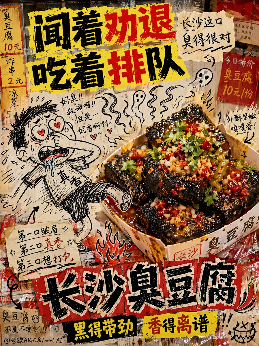
A creative and chaotic 'anti-design' meme poster prompt for Changsha stinky tofu, mixing hyper-realistic food photography with crude hand-drawn doodles.
프롬프트
창사 취두부를 위한 창의적인 합성 길거리 음식 광고, 16:9 가로 비율, 의도적으로 못생긴 안티 디자인 밈 포스터, 혼란스러운 저예산 음식 광고 미학, 의도적으로 어수선하고 어색한 구성. 배경은 기름진 야시장 질감, 저렴한 빨간색과 노란색 메뉴 조각, 얼룩진 플라스틱 테이블보, 제각각인 타일 벽 파편, 손으로 쓴 가격표, 기름 튄 자국, 보기 싫게 붙인 종이 요소들을 조잡하게 조합한 듯한 모습. 거칠고 고르지 않은 플래시 조명, 부분적으로 초점이 나간 느낌, 어색한 그림자, 잘못된 원근감, 의도적으로 다듬어지지 않은 '5분 만에 만든' 듯한 느낌.

중앙 오른쪽에는 주인공 제품인 정통 창사 취두부의 실사 사진이 배치됩니다. 취두부는 저렴한 종이 그릇이나 일회용 스낵 트레이에 담겨 있으며, 거칠고 구멍이 많은 질감의 짙은 검은색 바삭한 큐브, 황금빛으로 바삭한 가장자리, 선명한 빨간색 고추기름, 다진 고수, 다진 마늘, 잘게 썬 절임 콩, 틈새로 흘러내리는 윤기 나는 소스가 특징입니다. 눈에 보이는 김, 기름진 반사광, 바삭한 표면 디테일, 매콤한 향이 느껴지는 분위기, 강렬한 심야 길거리 음식의 사실감을 더하세요. 주변 디자인은 의도적으로 지저분하고 못생겼지만, 음식 자체는 초현실적이고 맛있어 보이며 군침이 돌게 표현해야 합니다.

실제 취두부와 어색하게 상호작용하는 요소로, 심심할 때 공책에 그린 듯한 조잡하고 낙서 같은 검은색 잉크 만화 캐릭터를 추가하세요. 비율이 맞지 않는 팔다리, 흔들리는 선, 서툰 해칭, 우스꽝스러운 표정이 특징입니다. 낙서 캐릭터는 한 손으로 코를 잡고 있고, 과장된 냄새 파동에 이끌려 창사 취두부 쪽으로 끌려가며, 눈은 하트로 변하고 침을 흘리며, 냄새에 마법처럼 이끌리는 듯 한 발을 공중에 띄우고 있습니다. 의도적으로 스케일과 원근감이 맞지 않게 배치하고, 낙서가 아주 형편없게 합성되도록 하세요.

음식 주변에 추가적인 못생긴 낙서 요소를 넣으세요:
비뚤어진 냄새 파동,
지저분한 화살표,
낙서 같은 불꽃,
어색한 작은 별들,
땀방울,
흔들리는 흥분 표시,
못생기게 그린 고추,
작은 유령 같은 향기 구름,
대충 휘갈겨 쓴 메모,
모두 거친 검은색 공책 낙서 스타일로 표현.

상단에는 의도적으로 못생겼지만 시선을 강탈하는, 자간이 엉망인 안티 디자인 타이포그래피의 중국어 슬로건을 추가하세요:

"Smells like a turn-off" (냄새는 질색)
"Eats like a long line" (먹으면 줄을 서게 돼)

근처에 작고 지저분하게 손으로 쓴 메모를 추가하세요:

"This Changsha bite" (창사의 한 입)
"Is stinky in just the right way" (딱 알맞게 꼬릿해)

하단 중앙에는 굵고 왜곡된 중국어 메인 타이틀을 추가하세요:

"Changsha Stinky Tofu" (창사 취두부)

촌스러운 안티 디자인 스타일의 가짜 길거리 간식 서브 브랜드 문구를 추가하세요:

"Black and powerful" (검고 강렬해)
"Fragrant beyond belief" (믿을 수 없을 만큼 향긋해)

선택 사항으로 추가할 못생긴 손글씨 중국어 문구:
"첫 입: 인상 찌푸림"
"두 입: 너무 맛있어"
"세 입: 집에 싸 가고 싶어"
기계 번역 — 실제 결과물을 만든 것은 원문 프롬프트입니다.
원문 프롬프트
Creative composite street-food advertisement for Changsha stinky tofu, 16:9 horizontal aspect ratio, intentionally ugly anti-design meme poster, chaotic low-budget food ad aesthetic, deliberately cluttered and awkward composition. The background looks badly assembled from greasy night-market textures, cheap red-yellow menu scraps, stained plastic table covers, mismatched tiled wall fragments, handwritten price boards, oil splatters, and ugly pasted paper elements. Harsh uneven flash lighting, slightly off focus in places, awkward shadows, bad perspective, and an intentionally unpolished “made in 5 minutes” look.

At the center-right is a real-life photograph of authentic Changsha stinky tofu as the hero product. The tofu is served in a cheap paper bowl or disposable snack tray, featuring deep black crispy cubes with rough porous texture, golden crunchy edges, vivid red chili oil, chopped coriander, minced garlic, pickled long beans, and glossy sauce dripping into the cracks. Add visible steam, oily reflections, crunchy surface detail, spicy aroma feeling, and strong late-night street food realism. The food itself should look hyper-realistic, delicious, hot, and craveable, even though the surrounding design is intentionally messy and ugly.

Awkwardly interacting with the real stinky tofu is a badly hand-drawn black ink cartoon doodle character, scribbly and crude like a bored notebook sketch, with disproportionate limbs, wobbly line art, bad crosshatching, and silly emotional expression. The doodle character is pinching its nose with one hand while being dragged toward the Changsha stinky tofu by exaggerated smell waves, eyes turning into hearts, drooling uncontrollably, one foot lifted off the ground as if the smell is magically pulling it in. The scale is wrong, the perspective is wrong, and the doodle is integrated terribly on purpose.

Add extra ugly doodle elements around the food:
crooked smell waves,
messy arrows,
scribbled flames,
awkward little stars,
sweat drops,
shaky excitement marks,
badly drawn chili peppers,
tiny ghost-like aroma clouds,
sloppy handwritten side notes,
all in rough black notebook-doodle style.

At the top, add a deliberately ugly but highly eye-catching Chinese slogan in badly kerned anti-design typography:

“闻着劝退”
“吃着排队”

Add a smaller messy handwritten side note nearby:

“长沙这口”
“臭得很对”

At the lower center, add a bold distorted main title in Chinese:

“长沙臭豆腐”

Add a fake street-snack sub-brand phrase in tacky anti-design style:

“黑得带劲”
“香得离谱”

Optional additional ugly handwritten Chinese copy:
“第一口皱眉”
“第二口真香”
“第三口想打包”