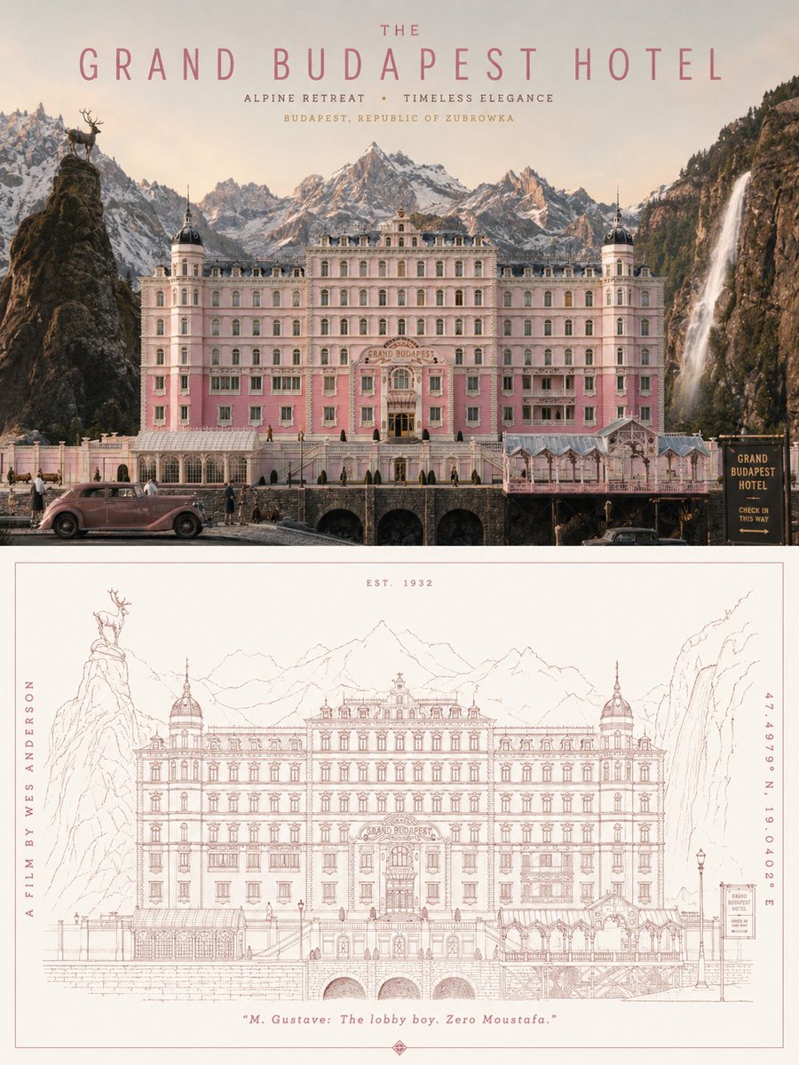
Geometric Line Art Architecture Poster
views72,000
likes926
comments6
shares104
bookmarks954
quotes7
Translated
Based on the last input theme, create an **ultra-high-resolution, printable 3:4 vertical poster**. Overall, use a diptych structure with two upper and lower areas, **with upper and lower heights in a strict 1:1 ratio, each occupying 50% of the canvas**.

**Upper half:** Generate a complete, unified, realistic, and vibrant scene based on the {argument name="theme" default="city"}. If the theme is a city, first understand its core temperament, extract visual clues from spatial landscapes, street life, human customs, commercial atmosphere, culinary memories, local culture, historical layers, and daily rhythms, and naturally organize them into a single realistic and vibrant city slice, not a scattered collage. If the theme is a specific street, neighborhood, landmark, commercial district, shop, building, or representative location, take the real spatial relationships as the core, accurately presenting the street structure, building facades, shop signs, transportation facilities, text systems, crowd states, and on-site atmosphere, retaining its most recognizable local characteristics. If the theme includes addresses, coordinates, or reference images, prioritize understanding the scene based on real information, do not fabricate from nothing, do not randomly replace location features, and do not draw unrelated generic landscapes. Overall, avoid cheap tourism promotion and postcard-like expressions, instead capturing a restrained, refined, realistic moment of the theme with a sense of daily warmth; people, buildings, streets, signs, windows, facilities, and activities coexist naturally, landmarks blend into the environment, without exaggeration or overshadowing the subject.

**Lower half:** Extract the **most recognizable subject, silhouette, structure, pose, and narrative relationship** from the upper scene, and reconstruct it into a **minimalist line-based graphic expression**. Do not mechanically trace details, but re-express with delicate and accurate single lines, clear geometric perspective, restrained white space, an orderly rhythm of details, and appropriately abstracted and generalized forms, retaining instantly recognizable thematic characteristics. If the theme leans toward city or location, extract its most critical building skyline, street interface, sign rhythm, transportation facilities, window relationships, or crowd states; if the theme is not a city, also extract its core identity characteristics, silhouette language, structural relationships, and visual memory points, transforming them into a unified, concise, modern, sophisticated line-drawn poster language. You may add a small amount of geometric auxiliary elements, horizontal lines, vertical composition lines, or rhythmic white space, making the lower half feel like a refinement and redesign of the upper realistic scene.

**Text system** needs to naturally integrate into the overall layout, continuing this restrained, sophisticated, and modern poster logic. Set a prominent main title at the top; the subtitle can use the original theme, local language, country or region information, address, coordinates, number, year, or a brief description. If the image includes street text, signs, or location information, it must be clear, natural, realistic, and professional, avoiding garbled text, errors, and random spelling. Text layout should be simple and orderly, together with the image forming the completeness of a collectible travel poster and city brand visual, rather than randomly stuck-on labels later.

Do not mechanically apply fixed color templates, but first understand the theme's own climate, light, sense of time, building materials, historical atmosphere, commercial temperature, culinary impressions, natural environment, and emotional texture, then extract **the unique primary and background color relationships for that theme**. Overall, you may use a monochrome printing aesthetic or a very small amount of restrained colors, creating rich variations through line density, lightness hierarchy, partial weight, white space proportion, and detail rhythm, avoiding monotony and flatness. The final product should present a **clear lines, rich details, unified style, quiet modernity, dynamic restraint, and sophisticated aesthetic** poster effect.
Machine-translated — the original is what produced this result.


