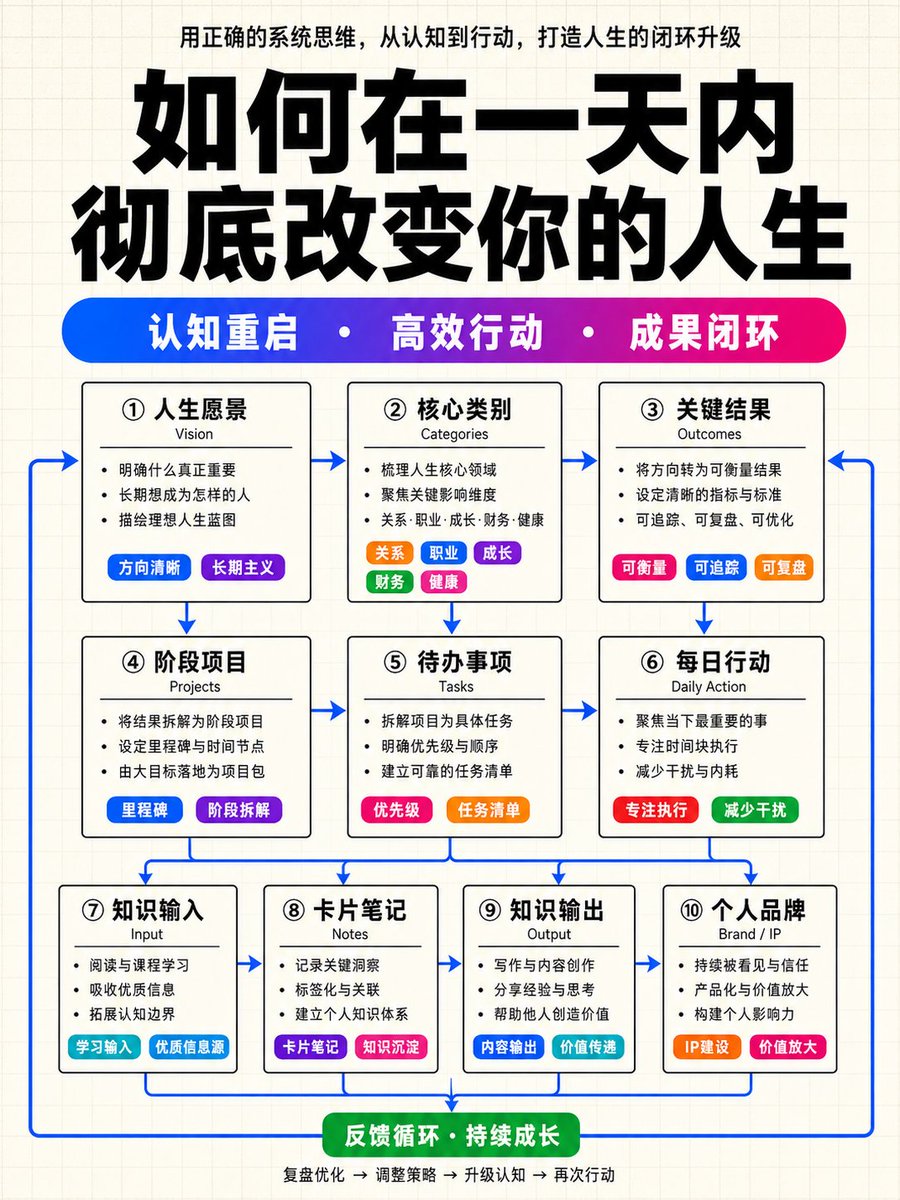
Structured Knowledge Architecture Infographic
views3,400
likes47
comments15
shares16
bookmarks49
quotes0
Translated
Please generate a high-level Chinese knowledge architecture infographic, vertical 9:16 composition, with the overall visual language fixed as: light beige grid paper background + cover-level ultra-large black title + high-saturation blue-purple-magenta gradient keyword capsule bar + white background with black border structural modules + colorful small capsule tags inside modules + blue arrow closed-loop connection. This is not a common flowchart or a tech UI panel. Please generate a high-level infographic like a high-quality knowledge blogger course cover, knowledge payment system diagram, or methodology architecture poster. The whole must be restrained, clean, and highly ordered, but local color labels should be eye-catching enough to make the image richer and more layered in color than common black-and-white architecture diagrams. ━━━━━━━━━━━━━━━ 一、Fixed Visual Style ━━━━━━━━━━━━━━━━ Background: Use a light beige white grid paper background. The background has very fine, very light gray grid lines. Prohibit gradient backgrounds. Prohibit dark backgrounds. Prohibit large-area shadows, glows, frosted glass, skeuomorphic cards, tech HUD, cyber UI, fancy illustrations. Overall temperament: Structure is minimalist, restrained, rational, and ordered. The main skeleton is black and white structure. Color is only used for keyword capsule bars, small tags, local emphasis blocks, and blue arrows. Do not make modules into large-area color cards. Do not make it business PPT gradient style. Do not make it complex mind maps. Do not make it common flowcharts. The correct direction is: black and white structure skeleton + local high-color tags + blue connection lines + cover-level title layout. ━━━━━━━━━━━━━━━ 二、Top Title Area Fixed Layout ━━━━━━━━━━━━━━━━ The top area from top to bottom is: Top description sentence located at the very top of the image. Centered layout. Use black or dark gray small text. Content automatically distilled from the 'content' below, expressing the theme description of this image. Normal weight, not too thick. Ultra-large Chinese main title: Use the 'top title' variable as the main title. The main title must be the largest visual element in the entire image. Use ultra-thick Chinese black, extremely high weight, strong oppressive force. The title occupies the main visual area at the top of the image. The title should not be thin, small, or light. The title can be divided into 1-2 lines, but must maintain cover-level visual impact. Horizontal high-saturation gradient keyword capsule bar: Located below the main title. Not three separate tags, but one long horizontal rounded capsule bar. The capsule bar color must transition from blue to purple, then to magenta/purple-red. The capsule bar contains 3 core keywords. The 3 keywords are automatically distilled from 'content'. Keywords use white bold text. Keywords are separated by white dots. This gradient capsule bar is the second visual anchor point of the entire image and must be eye-catching, vibrant, and exquisite. Format example: keyword one · keyword two · keyword three ━━━━━━━━━━━━━━━━ 三、Main Module Structure Fixed Rules ━━━━━━━━━━━━━━━━ The main body adopts a three-layer module structure, strictly aligned, equally spaced: First layer: 3 modules, Second layer: 3 modules, Third layer: 4 modules, totaling 10 white background with black border modules. Module appearance: All modules must have white background. Use black thin borders. Use extremely small rounded corners or near-rectangle. Do not use large rounded corners. Do not use soft shadows. Do not use glowing borders. Do not use glass texture. Maintain clear spacing and grid alignment between modules. Each module internally uniformly contains: Chinese module title: medium-sized slightly thick, clear and eye-catching. English subtitle: small, lighter weight, gray-black. 2-4 short sentences content: normal weight, short, restrained. Colorful small capsule tags: automatically inserted based on semantics as key emphasis. Module text length control: Chinese module title controlled in 2-6 characters. English subtitle controlled in 1-3 English words. Each body text controlled in 6-14 Chinese characters. Small capsule tags controlled in 2-6 characters. Delete repetitive, vague, long expressions, prioritize high-information-density short phrases. ━━━━━━━━━━━━━━━ 四、Content Automatic Arrangement Rules ━━━━━━━━━━━━━━━━ Users only provide 'top title' and a paragraph of natural language 'content'. Do not require users to manually split modules. You must automatically complete understanding, distillation, classification, compression, and tag-based layout. Please automatically generate the information structure according to the following logic: Top description sentence: Distill a theme description from the content. Style like a knowledge blogger cover small text. Short, with summary power, not exceeding 22 Chinese characters. Gradient keyword bar: Distill 3 core keywords from the content. Each keyword 2-5 characters. Must be highly summarized, suitable as cover keywords. Use white dot separation. First layer 3 modules: strategic layer / cognitive layer / result layer. Prioritize carrying: vision, goals, categories, core judgments, final results, system value. Second layer 3 modules: project layer / action layer / execution layer. Prioritize carrying: projects, actions, methods, tasks, operation paths, execution mechanisms. Third layer 4 modules: input layer / notes layer / output layer / brand layer. Prioritize carrying: input sources, information organization, notes precipitation, content output, productization, brand/IP amplification, feedback loop. If the content contains the following information, prioritize making it colorful small capsule tags instead of normal body text: classification, tags, sources, channels, methods, tools, emphasis points, differentiation, productization, branding, growth, amplification, IP. If the original content information is insufficient, still maintain the 3+3+4 module structure. Can make reasonable generalizations based on the original text semantics. Do not fabricate specific data, real cases, people, institutions, years, ratios. Uncertain content should be carried with abstract but specific expressions, such as 'content assets', 'method precipitation', 'feedback optimization'. ━━━━━━━━━━━━━━━ 五、Internal Module Color Dotting Rules ━━━━━━━━━━━━━━━━ The rich color sense of the entire image must come from local small tags, not large-area base colors. At least 5 modules must have high-saturation colorful small capsule tags inside. At least 3 different functional modules must have small capsule tags. Small capsule tags must be rounded corners, high-saturation, white text, and exquisite size. Recommended color pool: blue, purple, magenta/purple-red, pink-red, orange, green, cyan-blue. There should be obvious color variation between different tags; do not use the same blue for all. Tag usage suggestions: Classification modules: multiple different color small capsule tags arranged horizontally. Source modules: blue, cyan-blue, purple tags. Method modules: pink-red or magenta-red emphasis tags. Brand/amplification modules: orange or magenta-red emphasis tags. Feedback/loop modules: green or cyan-blue tags. Small capsule tag examples: 「input source」「tagging」「reuse」「productization」「IP amplification」 ━━━━━━━━━━━━━━━━ 六、Blue Arrow Closed-loop Rules ━━━━━━━━━━━━━━━━ Arrow style: All arrows uniformly use medium-high saturation blue. Lines are clear, sharp, and present. Do not use gray arrows. Do not be too thick. Do not be messy and tangled. Arrow relationships: Arrows must reflect system flow, not a static table. Flow from first layer to second layer. Flow from second layer to third layer. The third layer returns to upper layers or top via return arrows, forming a closed loop. Arrow numbers can be more, but must be neat, restrained, and ordered. Closed-loop logic: The image needs to express: cognition/goal → action/execution → input/output/brand → feedback/amplification → return optimization ━━━━━━━━━━━━━━━━ 七、Text Hierarchy and Weight ━━━━━━━━━━━━━━━━ Must form a clear hierarchy; do not have all text the same thickness. Weight from strong to weak: Main title: thickest, largest, strongest visual impact. Gradient keyword bar text: white bold, second visual level. Module Chinese title: medium-sized slightly thick. Colorful small capsule tag text: medium slightly thick. Module body: normal weight. English subtitle: lighter weight. Prohibit full-page thick black text. Prohibit all text same font size. Prohibit body text stealing visual weight from the main title. ━━━━━━━━━━━━━━━ 八、Final Image Verification Standards ━━━━━━━━━━━━━━━━ Before generation, please self-check, the final image must simultaneously meet the following standards: Is there a light beige white grid paper background? Is there a centered top description sentence? Is there an ultra-large, ultra-thick, cover-level Chinese black main title? Is there one long blue-purple-magenta gradient keyword capsule bar? Are there 3 white bold keywords in the gradient capsule bar, separated by white dots? Is it a three-layer structure, with module quantities 3+3+4? Are all modules white background with black thin borders, small rounded corners or near-rectangle? Do at least 5 modules have high-saturation colorful small capsule tags inside? Do the color tags include blue, purple, magenta, orange, green, cyan-blue, etc., with variations? Is a blue arrow used to form a closed-loop system flowing from top to bottom and back? Is the whole restrained, high-end, and ordered, instead of flashy, tech, business gradient, or common flowchart? If any item is not met, please prioritize correction before generating the final image. ━━━━━━━━━━━━━━━ 九、Prohibitions ━━━━━━━━━━━━━━━━ Prohibit: gradient backgrounds, dark backgrounds, large-area color cards, large-area soft shadows, frosted glass, tech UI, glowing borders, skeuomorphic illustrations, complex illustrated characters, common business PPT style, common flowchart style, mind map style, all modules same color, all text same thickness, gray arrows, lack of colorful small capsule tags, lack of blue closed-loop arrows, lack of top gradient keyword bar ━━━━━━━━━━━━━━━━ 十、Users Only Need to Modify the Following Two Variables ━━━━━━━━━━━━━━━━ Top title: [Fill in the main title here] Content: [Fill in a paragraph of natural language content here. No need to split modules, no need to write tags, no need to write layout instructions. Please automatically distill top description sentence, 3 keywords, three-layer 10 modules, colorful small capsule tags, and blue arrow closed-loop structure.]
Machine-translated — the original is what produced this result.


