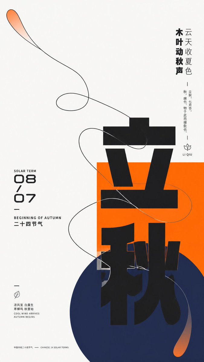
Modern Chinese Graphic Design Layout
views3,800
likes33
comments43
shares3
bookmarks20
quotes0
Translated
Create a modern graphic visual around {argument name="theme object" default="any theme object"}, featuring huge Chinese thematic characters, geometric color blocks, and a single-line organic contour traversing each other. Maintain a bright, pure background field overall, leaving more than two-thirds of the space as whitespace, with the primary visual weight carried by an off-center cluster area: a saturated {argument name="theme main color" default="theme main color"} rectangle establishes a stable plane first, with a deeper, lower-value cool-toned circle overlapping and extending beyond its lower boundary. The thematic core Chinese characters advance vertically with ultra-heavy, geometric strokes, crossing the white background, the rectangle, and the circle; incomplete occlusion and cropping create a strong jump in scale. On the left, a date and bilingual subtitle form a compact numerical column; on the right, a vertical inscription of varying thickness balances the weight. A small number of micro-explanations, short dashes, and linear symbols are scattered at the edges, forming a three-tier reading rhythm from the main character to the side notes to the details. Abstract the dynamic relationship derived from the theme into a continuous organic contour, using a clear, near-black single line to outline a broad, swirling form. This contour enters from the large whitespace, passes through the color blocks, and crosses their edges, intersecting itself multiple times while maintaining a distinguishable single path. Most of the contour's interior preserves the base color, with only the tips and extending segments featuring partial transparency of the theme's main color fading out, creating tension between the lightweight line and the heavyweight giant characters. Colors adaptively selected based on the theme: the largest area is a clean, bright, neutral base; the theme's main color remains vivid and high-saturation, used for the rectangle and partial transparent gradients; the circle uses a deep, cool support color with a distinct hue separation from the main color, blending the main color at its ends for soft diffusion; the text and contour use near-black, with a very small amount of light text pressing back onto the main color block. Fix unequal areas, light/dark levels, and saturation differences, but do not fix specific color names. All elements present a flat surface like matte digital printing, with sharp contour edges; gradients only feather slowly in two localized areas, without adding three-dimensional shadows, paper grain, or global lighting effects. The font maintains a low-contrast, broad, near-geometric Gothic skeleton; the main characters allow for elongated, offset, cut-out, and cross-color-block background-changing components; numerals use rounded, futuristic structures; small text is condensed with narrow width and loose letter spacing; brand, advertising copy, and specific dates are all replaced by the new theme information. The final image retains extreme whitespace, a central-lower geometric cluster, horizontal and vertical text pulling against each other, and the moment of organic lines traversing rigid graphics, avoiding uniformly filling all parts or simplifying the contour into isolated decoration.
Machine-translated — the original is what produced this result.


